CSS Beginner Struggles: aspect-ratio and height

Reviewing CSS from web.dev’s “Learn CSS!” course provided a refresher on a lot of material and also introduced me to new material I hadn’t seen before. I had hoped for a bit of “aha” insight to help me with CSS struggles in my project, but that didn’t happen. The closest was a particular piece of information (Flexbox for laying out along one dimension, Grid for two dimensions) that told me I’m on the right track using Flexbox.

A recurring theme with my CSS frustration is the fact height and width are not treated the same way in HTML layout. I like to think of them as peers, two equal and orthogonal dimensions, but that’s not how things work here. It traces back to HTML fundamentals of laying out text for reading text in a left-to-right, top-to bottom languages like English. Like a typesetter, the layout is specified in terms of width. Column width, margin width, etc. Those were the parameters that fed into layout. Height of a paragraph is then determined by the length of text that could fit within specified width. Thus, height is an output result, not an input parameter, of the layout process.

For my Compass web app, I had a few text elements I knew I wanted to lay out. Header, footer, sensor values, etc. After they have all been allocated screen real estate, I wanted my compass needle to be the largest square that could fit within the remaining space. That last part is the problem: while we have ways to denote “all remaining space” for width, there’s no such equivalent for height because height is a function of width and content. This results in unresolvable circular logic when my content (square compass) is a function of height, but the height is a function of my content.

I could get most of the way to my goal with liberal application of “height: 100%” in my CSS rules. It does not appear to inherit/cascade, so I have to specify “height: 100%” on every element down the DOM hierarchy. If I don’t, height of that element collapses to zero because my compass doesn’t have an inherent height of its own.

Once I get to my compass, I could declare it to be a square with aspect-ratio. But when I did so, I find that aspect-ratio does its magic by changing element height to satisfy specified aspect ratio. When my remaining space is wider than it is tall, aspect-ratio expands height so it matches width. This is consistent with how the rest of HTML layout treats width vs. height, and it accomplishes the specified aspect ratio. But now it is too tall to fit within remaining space!

Trying to reign that in, I played with “height: 100%“, “max-height: 100%“, and varying combinations of similar CSS rules. They could affect CSS-specified height values, but seems to have no effect on height change from aspect-ratio. Setting aspect-ratio means height is changed to fit available width and I found no way to declare the reverse in CSS: change width to fit within available height.

From web.dev I saw Codepen.io offered ability to have code snippets in a webpage, so here’s a test to see how it works on my own blog. I pulled the HTML, CSS, and minimal JavaScript representing a Three.js <canvas> into a pen so I could fiddle with this specific problem independent of the rest of the app. I think I’ve embedded it below but here’s a link if the embed doesn’t work.

After preserving a snapshot of my headache in Codepen, I returned to Compass app which still had a problem that needed solving. Unable to express my intent via CSS, I turned to code. I abandoned using aspect-ratio and resized my Three.js canvas to a square whose size is calculated via:

Math.floor(Math.min(clientWidth, clientHeight));

Taking width or height, whichever is smaller, and then rounding down. I have to round down to the nearest whole number otherwise scroll bars pop up, and I don’t want scroll bars. I hate solving a layout problem with code, but it’ll have to do for now. Hopefully sometime in the future I will have a better grasp of CSS and can write the proper stylesheet to accomplish my goal. In the meantime, I look for other ways to make layout more predictable such as making my app full screen.


The source code for my project is publicly available on GitHub, though it no longer uses aspect-ratio as per the workaround described at the end of this poist.

Notes on web.dev “Learn CSS”

Designing portrait and landscape orientation layouts for my compass web app was the first time I applied my media query lessons. Despite browser bugs out of my control making the app largely useless in landscape mode, it was educational to get some hands-on exercise with CSS. With new appreciation for CSS as well as new questions about how things are supposed to work, I thought it was a good time for a refresher course. Instead of going through Codecademy’s CSS courses again, I decided to get a different perspective and go through “Learn CSS!” on web.dev.

This course was one of several on web.dev, which comes from Google Chrome’s developer relations team. I learned of this site by attending the completely online Google I/O developer conference in 2021 and had marked it as a resource to explore later. Today is the day! For interactive demonstrations, web.dev doesn’t have an in-browser development environment of Codecademy. It uses little pieces of embedded codepen.io playground instead. After this course, I have a slight preference for codepen because I could use it independently.

As of this writing, the course is split across 28 sections, each focused on a topic. There seems to be a podcast series related to this course, though the sections do not necessarily correspond one-to-one with podcast episodes. As a result of this organization, some material is duplicated across multiple sections. For example, 021 Animations had some obvious overlap with 025 Transitions. They tend to show up together, even though not all CSS transitions are animated and not all animations are for transitions. Given this commonality, they both warn to consider users who prefer not to have too many things moving onscreen. Stylesheets should query prefers-reduced-motion and cut back on the flashiness.

Side comments about prefers-reduced-motion is representative of a big difference between this course and the Codecademy course: This course reminds us that not everyone can use a computer the same way and implores us to keep the web accessible to all. So animation sections mention prefers-reduced-motion. Color sections reminds us to keep color-blindness in mind. And the Focus section explains how to make sure a site is usable by someone that has to navigate with tab instead of mouse or touchscreen. These are all good points.

Given my most recent layout experience, the most relevant sections started with 008 Layout. I was very amused by the brief history lesson at the start, where it mentioned early HTML layout were done with <TABLE>. I’m old enough to remember those days! I even used <TABLE> layout for my primitive SGVHAK Rover interface, much to the horror of some people. All of my web development education is part of my efforts to catch up to the latest tools like 009 Flexbox and 010 Grid. From my Google I/O 2021 notes, I also learned Chrome developer tools included a lot of layout debugging assistance. There was even a code lab touring CSS Grid debug tooling.

I’ve come across Flexbox and Grid in the Codecademy course, and it has been fuzzy when one tool would be better suited for another. This course has a rule of thumb that I find valuable: Flexbox is for laying out items along one dimension: our choice of row or column. Whereas Grid is for laying things out across two dimensions: we’re always dealing with both rows and columns.

Coming from the Chrome team, I was not surprised that some of this course gets into implementation details that I wasn’t sure was strictly relevant. In 004 Specificity they describe the point score algorithm for determining how a browser chooses between multiple applicable rules. Informative, but I don’t think it is important to memorize the scoring algorithm, or at least I hope not, because I don’t want to put in the time.

In all this course was packed of a lot of information, much of which were immediately useful for me. Plus other information that I might have to come back later to absorb. There are only a few things — like specificity point score — that I doubt would ever be useful. My future projects may yet prove me wrong, and the best way to know is to dive right back into working with CSS.

Rudimentary Stylesheet for AS7341 Web App

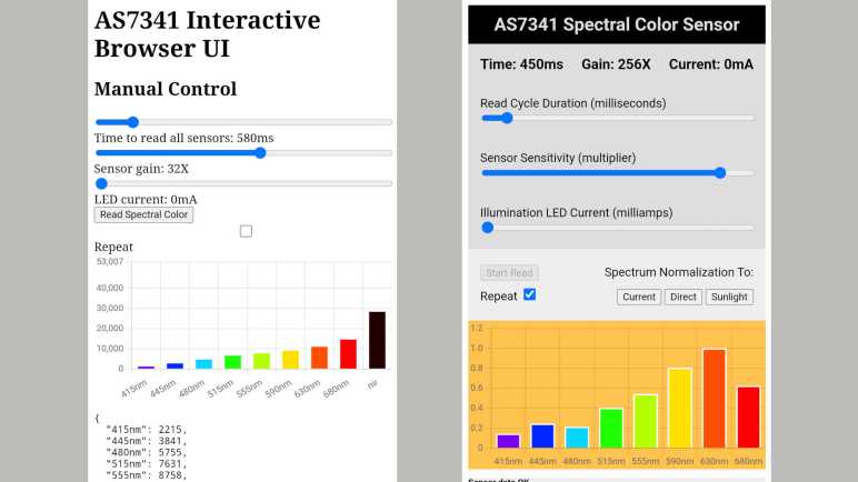
Writing a simple web app to interact with an AS7341 sensor, I initially focused on functionality. It didn’t much matter how it looked until I had basic parameter input and sensor value graphing output running. But now that I’ve got basic functionality in place, my attention turned to the CSS stylesheet. Up until this point my only item was to make input sliders full width of the window, as that helped me fine tune parameters and considered part of functionality. Now I’ll fill in the rest purely for aesthetics. I don’t need it to look gorgeous, but I did want to make sure it didn’t look embarrassing.

This was my first opportunity to apply what I learned from Codecademy outside of their CSS course exercises, though I did make this project easier for myself with a few design decisions. I didn’t need to drastically change the layout, HTML’s default top-to-bottom arrangement would suit me just fine. I’m only dealing with a single page, so there’s no concern of site navigation controls. And finally, I decided not to worry overly much about creating separate mobile vs. desktop layouts: everybody gets the same thing. No media queries in my stylesheet. I intended to use this web app on my phone, so I want it to look good in portrait mode. On my desktop, I can easily resize my browser window to match the aspect ratio of phone in portrait mode. The minimalist nature of this app meant there were no additional data I could add to a desktop view anyway.

Hit target size was a concern. Parameter sliders were fine, but I was worried about the buttons selecting normalization curve. Fortunately there were no problems in practice. However, I had some trouble with my “repeat read” checkbox being too close to the “Start read” button, and I think I will eventually need to space them further apart.

This was a good start. A few lines of CSS made the page look much more pleasant to my eye. Enough that I can go back and add a few more bits of nice-to-have functionality.


Code for this project is publicly available on GitHub

Problems with Codecademy “Learn Sass” Projects

I revisited Codecademy’s “Learn Sass” class for a quick review and also to check out new material added since my first run. I’m also a Codecademy Pro subscriber this time, which opened up the practice project assignments. The lessons went fine, but the projects did not. The learning environment was supposed to automatically compile SCSS to CSS every time I hit “Run”. But it was quickly obvious that changes I made to SCSS file were not being reflected in the corresponding CSS file nor visible in HTML. Is it another back-end failure like what foiled my Codecademy MongoDB course? Some debugging later, I figured out the problem: if I make a mistake in the SCSS file and create invalid Sass syntax, the background compiler runs and fails. This is a part of learning and is OK. What is NOT OK is the fact it silently fails without showing me an error message. This infuriating behavior is not the first time Codecademy did this to me. Fortunately, this time project material is easy enough for me to port elsewhere.

The quickest and easiest (if not the most efficient) way to do this was to fire up Visual Studio Code and tell it to build me a dev container. I could replicate most of this functionality on my own, launching a Node.js Docker container instance and mapping a volume to my GitHub repository working directory. But by using a published configuration file for Node.js JavaScript projects, I was up and running in a half dozen mouse clicks and much quicker than doing it on my own. After the container was up and running, I followed Sass installation directions to run npm install -g sass. Now I could run sass compiler myself and get error messages to help me fix my mistakes.

Even with that, though, I’m not out of the woods. This course is several years old and shows signs of lacking maintenance. One project stumbled into deprecated behavior that generated compile-time warnings.

Deprecation Warning: Using / for division outside of calc() is deprecated and will be removed in Dart Sass 2.0.0.

Recommendation: math.div($tons-produced, 3) or calc($tons-produced / 3)

More info and automated migrator: https://sass-lang.com/d/slash-div

   ╷
54 │     height: #{$tons-produced/3}px;
   │               ^^^^^^^^^^^^^^^^
   ╵
    main.scss 54:15  root stylesheet

Fortunately fixing this one is fairly easy, following the recommendation to wrap the calculation inside a call to calc(). But then it gets worse: we get a non-obvious error.

Error: Undefined operation "null % 3".
   ╷
56 │     @if($i % 3 == 0){
   │         ^^^^^^
   ╵
  main.scss 56:9  root stylesheet

I understand the intent of the project, but I don’t know why this code isn’t working. Even after I copied directly from the answer key to verify I’m not just making a silly typo somewhere. $i was defined in the @each loop and we could use at the top level of the loop successfully. But this line is in an inner scope and using $i is an error here. My hypothesis is that I stumbled into a Sass breaking change regarding variable scopes.

Even if I ignore these technical errors, I’m not terribly fond of these projects. This particular error was from a project using CSS to build bar charts. Would anyone actually do this? It feels like a pointless demo showing something could be done but not something actually useful. Due to this and the fact we are looking at old material, I didn’t get as much out of these projects as I had hoped. I shrug and move on.

Notes on Codecademy “Learn Sass”

Reviewing what’s new (and relevant to me) with Angular over the past two years, I saw improved support for Sass listed. As soon as I saw that, I realized I should review Sass before diving into Angular again. Codecademy has a “Learn Sass” course and based on my notes here I’ve taken it once years ago. My Codecademy progress tracker page showed the course as “Completed” as well. But when I clicked “Start”, my progress bar dropped to 41% complete. This is because the course had a few updates in the “Sustainable SCSS” section. There’s also the fact that my previous run was without a Codecademy Pro subscription, so I didn’t have access to the projects section of the course.

Reviewing the Lessons turned out to be quite useful, as I had forgotten some of Sass and other pieces took on a different meaning in light of other recent classes I’ve taken. Notable Sass features include:

  • Nesting: the course started with nesting clauses, which is still my favorite part of Sass and probably still the biggest value added. Keeping related CSS rules together in a parent/child hierarchy helps understand organization in a style sheet, we no longer have to memorize which rules we’ve seen elsewhere.
  • Variables: The Sass variables mechanism isn’t exactly the same as CSS variables a.k.a. custom properties, but they solve many of the same problems. Historically, Sass variables existed before CSS variables support were widespread among browsers.
  • Functions: Sass functions also start with a fixed set just like CSS functions. (We can’t declare our own functions.) But Sass goes further by giving us features like loops and if/else which I haven’t seen from CSS functions.
  • Mixin: The final major Sass feature I liked. A @mixin is a CSS macro that we can then use elsewhere in the style sheet via @include. As demonstrated in the course, this is great for packing all different vendor prefixes into a single line.

The course covered other topics, but they didn’t stand out as much to me. Maybe I’ll value them after tackling more projects. I’m curious if the best practices recommended in “Sustainable SCSS” would be very practical elsewhere, especially something like Angular which imposes its own project file structure.

So the lessons review were fine, and now with a Pro subscription I wanted to give the projects a shot. I ran into problems immediately: my changes in .scss file did not reflect on .css, nor are changes visible in rendered HTML. What’s going on? Time for some debugging.

Notes on Codecademy “Build a Website” Off-Platform Projects

Most Codecademy courses involve interactive learning inside their in-browser learning development environment, but occasionally we are directed to get off Codecademy platform and build something on our own. I have set up nginx as a local development web host (not the best use of nginx) serving files directly off a GitHub repository for these projects. This repository is, in turn, set up to host project content via GitHub pages. After this infrastructure is setup, I dove in to the off-platform project assignments of Built a Website with HTML, CSS, and Github Pages skill path.

The first project was “Dasmoto’s Arts & Crafts”, a relatively simple art shop landing page exercising a beginner’s level of HTML and CSS. We are given the images to use, and a specification of how the site should look. This was a practice exercise intended for us to run directly off local filesystem, without even a web server. But where’s the fun in that? I built this project locally, serving my files via nginx.

The next project was “Tea Cozy”, a more sophisticated tea shop landing page. This was from “Flexbox and Grid” section that pulled in most of the material of Learn CSS: Flexbox and Grid. Again, we are given a set of images to use, and a specification for how the site should look. This layout is far more complex than “Dasmoto’s Arts & Crafts” project, requiring use of (no surprise) flexbox and grid. I enjoyed the challenge of building “Tea Cozy” and I feel I have a much better grasp of flexbox & grid after this project.

Towards the end of the skill path was a project “Excursion”, a coming-soon phone app landing page. In addition to the images, we also had a video to embed. I had thought it be more of a skill practice than “Tea Cozy”, but it turned out to be far simpler with minimal layout challenges. The focus of this exercise was on GitHub Pages, a topic I had already put in the time to learn, so I blitzed through it relatively quickly. My only problem was trying to incorporate the copyright symbol, which wasn’t as simple as copy and pasting the Unicode character. A strange character gets added whenever I try to do so! I decided this problem wasn’t technically a HTML/CSS issue and punted.

And finally, we have a capstone project “Colmar Academy” educational institution landing page. We have a lot of added complexity in this project. This is the first project to require responsive layout, with both desktop and mobile views required. Some of the images provided had corresponding high-resolution desktop and low-resolution mobile versions. There was a video, and we even get a few icons in the form of SVG files. The specification we were given for this project was more loosely defined, with fewer explicit details, and we are to use our design sense to fill in the gaps. For example, it was up to us to decide where our media query breakpoints would be to transition between desktop and mobile views. This project took a lot of time, but it was time well spent because of everything I learned while doing it. At the moment, my biggest unsolved mystery is how to switch between desktop and mobile images from CSS. I couldn’t change the value of src property on an <img> tag from CSS! I ended up using two <img> tags, one with the desktop image and one with the mobile image and using CSS media query to set one of them to display: none; This feels inelegant, and I hope I learn a better way to do this in the future.


My code for these assignments are publicly visible on GitHub.

Notes on Codecademy “Build a Website with HTML, CSS, and Github Pages” Skill Path

After finishing Codecademy’s navigation design course, I thought it had some interesting information but it also spent too much time on CSS tricks I did not expect to be broadly applicable to future projects. Completing that course also meant I had covered majority of Codecademy’s courses under HTML & CSS section of the catalog. However, there are a few items listed that were not “Courses” so I thought I would check out a “Skill Path”. According to Codecademy, a skill path is focused on delivering the knowledge necessary to accomplish certain tasks. I paraphrase it as “Teach me what I need to know to accomplish X” versus a course which is more “Tell me about Y and how I might use it.”

In practice, judging by my first skill path “Build a Website with HTML, CSS, and Github Pages” (Or the shorter “Learn How to Build Websites” as per the URL) a skill path repackages a lot of components pulled from other Codecademy resources. Mostly individual lessons (modules?) but also other resources like their articles and blogs. After taking majority of Codecademy courses on HTML/CSS, going through this skill path was a little disorienting because their backend had tracked which modules I’ve already done. This meant that as soon as I clicked on starting this skill path, my progress was immediately over 50% complete. Looking over the skill path syllabus, I could see what I’ve already done and the gaps I still need to cover.

Most of the gaps were information presented Codecademy articles, covering things like how to set up a code editor like Visual Studio Code. (My personal choice.) Some of the gaps were modules on courses I hadn’t bothered to take, for example the command line course as I was already quite comfortable, but I was able to blitz through quickly.

A surprise was the gap on web accessibility. I thought this was an error as I had taken their Learn CSS Accessibility course, but the database is correct: this was a different course with material I had wished was in the CSS accessibility course. Starting with basic background and on to how to set up a screen reader for us to explore how these features will be consumed. I also appreciated more information on ARIA roles, where I learned we can put down some very fine-grained annotations for accessibility. There are a lot more ARIA roles than there are semantic HTML elements. It’ll take a lot of learning and practice to do ARIA well, but if the spec is too overwhelming, we can start with MDN’s introduction to ARIA.

I was heartened by this coverage of web accessibility but was then disappointed by its coverage of Font Awesome. Which I learned is a huge collection of icons (apparently not fonts as the name implies) available for use in websites. Icons are inherently compact way of visual communication, so we need to pay more attention to their use to ensure they are accessible. Unfortunately, not only did the course not cover how to maintain accessibility, it does not even mention accessibility as a concern when using icons.

One section I’m glad they put in this course is “Documentation and Research”. There’s no way for the course to cover everything, so it needs to teach people how to look stuff up on their own. For web developers, this means the holy trinity of MDN, Google, and StackOverflow. And for beginners who needed the exercise, a broken web site to fix by looking up the problems.

The real star of the skill path, though, are the off-platform projects. I like learning with Codecademy and its embedded interactive development environment. We can get a lesson side by side with sample code we can play with. However, these are all fairly basic fill-in-the-blank types of exercises. To be a web developer we need to be able to build a page from scratch, which is where these off-platform projects come in. We are given the assets (images and occasionally video) and a specification of what to build, but no templates. We had to create our own index.html and style.css from scratch and serve it up to in a browser to see our results. This course covered developing on the local file system, and using GitHub Pages, but I decided to add one more option to the mix: I thought it’d be a good exercise to setup nginx for local development hosting.

Notes on Codecademy “Learn Navigation Design”

I was definitely out of my depth with Codecademy’s color design course, but I was happy to absorb what I can and move on to another topic of novelty: Codecademy’s “Learn Navigation Design” course. Just as color could give subtle hints to the user on how to best interact with the site, so does applying good design to navigation elements. It’s something that we would rarely consciously notice until we encounter a poorly designed page, which is of course how this course started: by showing us an intentionally badly designed page and go up from there.

I was surprised that the first topic was how to show links on a page. After all the link styling in previous CSS courses and speaking of the user agent (browser default) stylesheet as a source of problems, this course presents the other side of the story: Hang on, guys, there are good reason they’re the way they are! And if we arbitrarily toss out all of those traits, site usability will suffer. Hover states are discussed here, and this time we’re reminded of their absence on touchscreen devices. We also get a link to MDN on pseudo-classes, information missing from the color design course!

Moving on from links to buttons, it started with an explanation of skeuomorphism vs. flat design for user interactive elements like buttons. This course covers examples for both styles. I’m personally a fan of the flat school of design. If somebody wants to do skeuomorphism on a button, I demand that they look like keys on an IBM Selectric typewriter.

After buttons the course talked about secondary navigation in the form of breadcrumbs on the page, usually found at the top of a site just before the header block. I appreciate an overview of the concept, but some of the examples get into fancy CSS tricks. I don’t think they’ll be generally applicable to all sites and I’m wary they degrade a page’s accessibility.

This navigation design course barely scratched the surface of User Experience (UX) design, but of course there’s an entirely separate Codecademy course “Introduction to UI and UX Design“. Looking over its syllabus, it doesn’t feel like the material would be useful in my personal tinkering projects. There’s also the fact that course was “Built in partnership with Figma” and the final section of the course is “Prototyping with Figma.” Is this course just an extended ad for Figma? I don’t know and at the moment I’m not terribly interested in finding out. At least Figma offers a free starter tier, if I decide to come back to this later.

Right now, I’m more curious about checking out Codecademy’s “Skill Path” offerings.

Notes on Codecademy “Learn Color Design”

After a brief overview of CSS browser compatibility concerns, which wrapped up Codecademy’s Learn Intermediate CSS curriculum, I looked at what remained under Codecademy’s HTML/CSS umbrella and started their Learn Color Design course. This is a less technical course more focused on art & design perspectives, so I knew it would take more effort for me to grasp all the concepts.

At least they started easy (for me) by going over HSL versus RGB for specifying color, and how HSL is easier to work with from a color design perspective. This is something I had learned from working with Pixelblaze and most of the concepts transfer easily. But then we moved quickly into concepts I had never encountered before, like designing color schemes. I liked the fact that the course material stayed with a same example page and changed colors around to illustrate monochromatic, complementary, analogous, and triadic color schemes. Keeping the content identical and changing just the color did help me see the effect somewhat, even if I am not familiar with the kind of vocabulary used. For example, I don’t know what it means for a color scheme to “create a sense of equality, vibrancy, and security in your designs”. These “Color Psychology” concepts are very foreign to my brain and will take time to absorb. Some of the vocabulary is new to me, too, using familiar words in unfamiliar ways. There was a quiz question “How is a shade of a color produced” and none of the possible answers made sense to my brain until I returned to course material and reviewed how the vocabulary is defined in this specific context.

This course had a gem of a quote that I wished more web designers took to heart:

Remember that most users skim websites! They are not reading every word and checking every menu—you need to guide the user to the most important content with good color choices.

Like the lecture, the practice exercise gave us a site that was mostly grayscale and had us add color to it. The instruction ends with an encouraging “Now our site is looking great!” but it really doesn’t. I have yet to master the subtleties in choosing colors and to compensate I intend to use color schemes built by others as much as I could. But this course gave me some foundation so I could appreciate those prebuilt color schemes. It also helped me appreciate BrandColors, a collection of color schemes associated with many brands we see in our everyday lives.

There was an optional resource that pointed to Adobe Color with the claim “you will learn to use Adobe Color” but when clicking the link, I was redirected straight to the color wheel tool. It’s not immediately obvious where I could find anything instructional to help me learn, I think that URL might be outdated. The same “dropped into a tool with no instructions” problem applied to another optional resource, a color tool by CloudFlare Design. (Not to be confused with the CloudFlare that handles DDoS attacks.)

After some experimentation with color, we are to put that theory into practice by applying color for UI. Again, the instruction materials used a sample page that started out mostly grayscale and we added colors as we go. UI-specific concepts are added, such as using colors for button hover and disabled states. An aside: I wish this class discussed the fact that hover is absent from touchscreens and how design should change in response. And speaking of wishes, an earlier wish was granted here: we finally have a discussion on color blindness and given ColorSafe as a tool to help. Another realization I had during this course is that we never really had a discussion on CSS pseudo-classes, which we use to style things like hover states. A quick web search found this MDN resource as a starting point for later research. For now, I will proceed to the navigation design course.

Notes on Codecademy “Learn CSS: Browser Compatibility”

Web developers must keep in mind not everyone can see and interact with a site in the same way. This is not just a fundamental of web accessibility, but also the fact there are many different web browsers out there running on a huge range of hardware platforms. They won’t all have the same capabilities, so with that fact in mind we proceed to “Learn CSS: Browser Compatibility“.

The first and most obvious topic is CanIUse.com, our index for features supported in various browsers and an invaluable resource. After that, the course talks about how different browsers have different default style sheets. There are reference resources to see what they are, and there exist tools to mitigate differences with a “normalized” or “reset” stylesheet. But if we simply can’t (or won’t) stay within standardized subset, we can use “prerelease” features via vendor prefixes. Either manually or via automated toolsl like Autoprefixer. This is the first of many tools within a whole category called “polyfill” that implements newer features in a backwards compatible way, making user experience more consistent across older/less supported browsers. I knew there were polyfill tools for transpiling new JavaScript features to run on browsers with older JavaScript engines, but I hadn’t know there were CSS polyfill tools as well. Perhaps I needed to pull in one of them to run Angular on Windows Phone? Codecademy pointed to Modernizr and Polyfill.io as starting points to explore the world of polyfills.

Polyfill tools run at development time to decide what to do. But what if we can adjust CSS at runtime? This is the intent of CSS Feature Query, whose syntax looks a lot like CSS Media Query but for browser CSS feature support. Using this feature, however, is a bit of a Catch-22. Not all browsers support CSS Feature Query and obviously those browsers wouldn’t be able to tell us as such via the very mechanism that we’d use to ask for such information. This impacts how we’d write CSS using feature queries, and a likely place for bugs. Finally: we’d need some ability to debug feature query issues via browser developer tools, but a quick web search came up empty.


Completion of this course also gave me Codecademy completion credit for their “Learn Intermediate CSS” course, which is a packaged compilation of the following set of courses I took individually:

  1. Learn CSS: Flexbox and Grid
  2. Learn CSS: Transitions and Animations
  3. Learn CSS: Responsive Design
  4. Learn CSS: Variables and Functions
  5. Learn CSS: Accessibility
  6. Learn CSS: Browser Compatibility

But Codecademy had even more web styling classes beyond this package! I proceeded onward to learn color design.

Notes on Codecademy “Learn CSS: Accessibility”

During Codecademy’s “Learn CSS: Variables and Functions” course, I was mildly disappointed to learn that CSS custom properties and fixed calculation functions were far less powerful than I had mistakenly thought from the course title. No matter, they are sufficient for their intended purpose, and they are valuable tools for building pages that are inclusive to all users. Which is why the next class in Codecademy’s CSS curriculum is “Learn CSS: Accessibility.

First up is the size of text, the most significant factor in typographical design. This is a deep field with centuries of research from the print world, Codecademy can’t cover them all and correctly doesn’t try. We do get a bit of coverage on font-size, line-height, and letter-spacing. One oddity: a conversation on paragraph width introduces the CSS unit “ch” with 1ch being width of the zero character. (“0”) This allows specifying lengths in a way that scales with the font, but that sounds like what “em” does as well. A quick search didn’t find why we would use “ch” vs. “em”.

Another topic was color and contrast. The expected color wheel discussion talks about selecting different colors with high contrast, but it didn’t talk about color blindness. The course linked to a contrast checker tool by WebAIM, but it didn’t mention color blindness, either. A quick search on WebAIM site found a page for color blindness, but it is incomplete. The page ends with an example: a train map where routes are represented by colors. The page tells us that the different routes would be difficult to tell apart for the color-blind, but it doesn’t give us a solution to the problem! My guess? Maybe we can use different line styles?

This section also taught me there is a semantic HTML tag for denoting abbreviations.

<abbr title='Cascading Style Sheets'>CSS</abbr>

I don’t think this should be classified as an accessibility measure because it would be helpful for all audiences. This information is certainly available to screen readers, but there is some visual indication on a normal rendering. My browser renders it as dotted underlined text by default. (“user agent stylesheet”)

abbr[title] {
    text-decoration: underline dotted;
}

Another topic I didn’t think should be classified as accessibility is a discussion on changing rendering for print media. This should have been part of the media queries course, but at least the concepts make sense. When the user is printing out a web page, we can do things like hiding a navigation bar that wouldn’t have done anything on a sheet of paper. This course also talks about printing the URL of a link, because you can’t click on a sheet of paper.

@media print {
  a[href^='http']:after {
    content:  ' (' attr(href) ')';
  }
}

However, this would only work for short URLS that can be reasonably typed in by hand. Many links of the modern web have long URLS that are impossible to accurately type in by hand. But on this vein, I think it would be worthwhile to print out the content of <abbr> tags as well.

Anyway, back to accessibility and screen readers. A section asserts that there are frequently items that are not useful for a screen reader and should be hidden. I think I understand the concept, but I thought the example was poor: In case of duplicate text, one of them could be hidden from screen readers with the aria-hidden='true' attribute. But it seems like the real fix is to remove duplicate text for all audiences! Another problem is this introduction of aria-hidden without saying anything more about it. A quick web search found this is just the tip of an iceberg called the Accessible Rich Internet Applications specification.

After the lecture, we are encouraged to read “Start Testing for Accessibility.” A short overview of several accessibility testing tools: Lighthouse, WAVE, Axe, and Accessibility Insights.

I know I have a lot to learn about web accessibility, not the least of which is learning about other ARIA properties. But there’s another side to the “not everyone sees the same web page as you do” problem: browser compatibility.

Notes on Codecademy “Learn CSS: Variables and Functions”

Following responsive design in Codecademy’s CSS curriculum is “Learn CSS: Variables and Functions“. I was intrigued by the title of this course, as “variables” and “functions” were features unexpected in a visual appearance style description syntax. I associate them with programming languages! Does their presence mean CSS has evolved to become a programming language in its own right? After this class, I now know the answer is a definite “no”.

First of all, CSS “variables” are far less capable than their programming language counterparts. The name isn’t even really accurate, as a value does not vary (hence not variable) after it is set. A value declared by one CSS rule can be overridden by a more specific CSS rule declaring something with the same name, but that’s more analogous to variable scope than actually varying its value. This mechanism is also known as CSS custom properties, and I think that is a much more accurate name than “variable” which oversells its capabilities.

That said, CSS custom properties have their uses. This course showed several cases where custom properties can be overridden by CSS rules to good effect. The first example I found very powerful is combining custom properties and media queries. It makes for a far cleaner and more maintainable way to adjust a stylesheet based on screen size changes. The second significant example is in the exercise project, where we could create multiple themes on a web page (Light Mode/Dark Mode/Custom Mode) using custom properties.

Moving on to “CSS functions”, I was disappointed to learn that we’re talking about a fixed set of data processing/calculation functions implemented by the runtime environment. We can’t actually declare our own functions in CSS. CSS functions are nowhere as powerful as C++ functions. They’re not even as powerful as Microsoft Excel functions, as CSS style sheets are not spreadsheets.

Like almost every standard associated with HTML, we see a specification that tried to rationalize a lot of ad-hoc evolution and failing to hide all of the seams. The one inconsistency that annoys me is the fact some function parameters must be separated by commas, and other functions require parameters to be separated by spaces. It is especially jarring when the two styles are used together, as in this example used in the course:

filter: drop-shadow(10px 5px 0.2rem rgba(236, 217, 203, 0.7));

The drop-shadow() parameters are separated by spaces, while the rgba() parameters are separated by commas. What a mess! How can we be expected to keep this straight? Still, these functions should suffice to cover most of the intelligence we’d want to put in a style sheet. I was most impressed that calc() tries to handle so much, including the capability to mix and match CSS units. I know the intent is to allow things like subtracting a pixel count from a percentage of width, but I see a debugging nightmare. The course covered only a subset of the set of functions, but of those that were covered my favorite is clamp(). I expect to use that a lot.

One unanswered mystery is the class recommends that we set global custom properties using :root pseudo-class as the specifier. The instruction said this is usually the <html> tag, without explaining exceptions to that rule. When is :root not <html>? The MDN documentation unfortunately doesn’t answer that question either. I’ll have to leave it as a mystery as I proceed to learn about web accessibility.

Notes on Codecademy “Learn CSS: Responsive Design”

Following a quick tour through CSS transition animations, next course on the Codecademy CSS curriculum is “Learn CSS: Responsive Design“. Up until this point, Codecademy CSS curriculum had primarily demonstrated concepts using unit measurement of pixels. This course brings us into the real world where pages have to adjust themselves to work well on devices ranging from 4.5″ cell phone screens to 32” desktop monitors.

The first focus is on typography, since most pages are concerned with delivering text for reading. Two measurements work based on font size: em is relative to the base font size of a particular point in the HTML tree, varying relative to its hierarchy. rem ignores the hierarchy and goes directly to root <html>.

Next, we move on to percentages, which are calculated based on the parent width of an element. There were a few paragraphs dedicated to how height calculations are based on parent width instead of parent height, but I didn’t understand why. There was an example of how parent height could be affected by child height so using percentages would cause a circular reference problem, which I understood. But wouldn’t the same problem occur on the width dimension as well? We can specify child width as dependent on parent width, and parent width dependent on contents (child width.) Why wouldn’t this cause the very same circular dependency? I don’t understand that part yet.

When I first started trying to write a HTML-based UI for controlling SGVHAK and Sawppy rovers, I learned of a chunk of HTML that I needed to put into phone-friendly HTML. I didn’t understand what it meant, though, it was just “copy and paste this into your HTML”.

<meta name="viewport" content="width=device-width, initial-scale=1">

With this class I finally got this item checked off the “need to go and learn later” list. Codecademy even included a pointer to a reference for viewport control. This viewport control reference mentioned a few accessibility concerns, but I don’t really understand them yet. I expect to learn more HTML accessibility soon as it is listed later in Codecademy CSS curriculum.

Viewport led into media queries, another essential tool for pages to dynamically adjust between desktop, tablet, and phone usage. Most of the examples reacted to viewport width, which I understand to be the case most of the time in the real world. But this barely scratched the surface of media features we can query for. The one most applicable to my rover UI project is the “orientation” property, because that will let me reposition the virtual joystick when the phone is held in landscape mode.

Most of this course consisted of making changes in CSS then manually resizing our browser window to change viewport width and observe its effects. But again, width is but one of many media features that can be queried, and it’s not obvious how we can explore most of the rest. I wish this course included information on how to test and debug media query issues using browser developer tools. Such a walkthrough was quite informative in the JavaScript course and its absence here is sorely missed. A quick web search found the Media Query Inspector which looked promising at first glance, I’ll have to dig into that later. For now, it’s onwards to Codecademy’s CSS Variables and Functions.

Notes on Codecademy “Learn CSS: Transitions and Animations”

After an interesting and occasionally challenging time with Codecademy’s “Learn CSS: Flexbox and Grid” course, I followed their recommended CSS curriculum onward to “Learn CSS: Transitions and Animations“. It was an interesting and worthwhile unit, and thankfully shorter than the previous course on flexbox + grid. This is in part helped by a narrower scope: the CSS animation system does not attempt to cover all possible animations anyone may want to put on screen. It only animates a specified subset of CSS properties, but doing so covers majority of animation effects useful for adding visual interest and improving the user experience. As opposed to early HTML <BLINK>, a design misstep which definitely did not improve user experience.

Every animation system shares some fundamentals: what to change, where+when to start, where+when to stop, and how to move between start and stop points. That’s quite a few parameters to change and managing them quickly becomes cumbersome as the number of adjustable knobs increase. But CSS animation has a narrow scope, limiting the complexity somewhat. It also has a benefit: the start and stop state are specified by existing CSS mechanisms, leaving the transition system to deal with the animation-specific parameters.

This actually plays into an advantage of using CSS shorthand, which usually annoys me as presenting multiple ways to describe the same thing. Here multiple transition parameters can be collapsed into a single transition. It has all the annoyances of shorthands: it is another way to describe the same thing, and it requires memorizing an arbitrary order of parameters. But here transition has an advantage. We have the option to list multiple transitions in a comma-separated list and they will all execute simultaneously when triggered. The course called this “chaining” animations. I don’t know if the word “chain” was part of CSS specification or just a word choice by the author of this Codecademy course, but I found it misleading because “chain” implies animations that run consecutively (one after the other) instead of all animations running simultaneously in parallel.

Another way to specify multiple animations that run simultaneously is to specify “all” as the animated property. (The “what to change” parameter.) This would apply the same animation duration, easing function, and timing delay to all transitions that apply to an element. This is possible because the start & stop states were specified elsewhere in CSS. I see this as a very powerful mechanism in an “easy to shoot myself in the foot” kind of power. By specifying “all” we commit to animating all applicable property changes now and in the future. Which certainly means surprising behavior in the future when we add another change then surprised to see it animate. Followed by a debugging session that ends with “Oh, this transition applied to ‘all’.”

One thing I did not see is a way to create animated transitions between different layouts, for example when triggered by mechanisms covered in the CSS Responsive Design course. Perhaps that is not a scenario the CSS people deemed important enough?

Notes on Codecademy “Learn CSS: Flexbox and Grid”

After I took Codecademy’s “Learn CSS” course, I figured out it packaged together four shorter courses. Some of these short lessons were all material I’ve learned before and are just a review, so I flew through them quickly enough that putting together in a single “Learn CSS” made sense to me. This situation changed dramatically for the next item on the list: “Learn Intermediate CSS” is again a packaging of several shorter courses, except now the material is new to me and started with CSS flexbox. This was a new and challenging concept for me to grasp, so now I’m in favor of going by the shorter courses instead of the (now quite hefty) package.

Learn CSS: Flexbox and Grid covers the first two lessons of Learn Intermediate CSS. As soon as we started with CSS flexbox I could tell it was a powerful tool. However, this particular course fell short of the normal Codecademy standards. For each function of flexbox, we run through simple illustrative examples, which is good. Unfortunately, these small examples were too simplified for me to understand how they would be applied. In other words, we see a lot of small pieces but the course never pulled them together in a bigger picture.

My personally attempt at summarizing flexbox is: a CSS construct that attempts to capture rules for laying out child elements in a way that is flexible to changes in screen size and aspect ratio. Since there’s no way to capture every possible way to lay things out, the subset supported by flexbox thus becomes a de-facto prescription of best-practice layout from the people who designed this CSS feature. Nevertheless, there are more than enough (possibly too many) knobs we can adjust to build a layout.

While going through the simple examples, I did see certain values that appealed to my personal style. They were, however, usually not the default value. For example, when covering justify-content I thought space-between (evenly distribute available space between elements, spread across available width, leaving no wasted space at left and right edges) looks best, but the default value is actually flex-start (pack elements to the start of flow (left) and leaving empty space to the end (right)). I understand choosing a default value is challenging and I’m ignorant of many of the concerns that went into a final decision. Sometimes the default behavior to “makes sense” are actually inconsistent. For example, the default flex-shrink value is 1, but its counterpart flex-grow has a default value of 0.

After the chaos of JavaScript shorthands, I thought I was freed from that thinking in CSS. No such luck. To specify dynamic scaling behavior in a flexbox, somebody thought it would be useful to combine flex-grow, flex-shrink, and flex-basis parameters into a single flex shorthand. As a beginner, I am not a fan of memorizing an arbitrary order of numbers, but maybe I’ll grow to love it.

The feature of flexbox that most surprised me is ability to flip its two axis with flex-direction. Not only would this let us build right-to-left layouts (for Hebrew, Arabic, etc.) this even hints at the ability to build layout for traditional Chinese layout. (Words top-to-bottom in a column, then columns laid out right-to-left.)

The Codecademy project for flexbox “Tea Cozy” is simultaneously really great and really awful. They gave us a set of images, most of which are pictures to use in a layout except one image which is actually the specification for laying out a page. So we are given a picture of what the result should look like, including some key dimensions, and told to go make it happen. I understand this is highly representative of the workflow of a web developer in charge of laying out a page according to a design specification, so that is really great. But given this course has been short on the “why” of things (each lesson is “do X and Y” instead of the much more useful “Do X and Y to accomplish Z.”) it was difficult to figure out which of the tools we just learned were applicable. I faced a wide knowledge gap between course material and building “Tea Cozy”. Still, I enjoyed the challenge of this exercise. And for better or worse, I did come out of “Tea Cozy” with a better understanding of flexbox.


Outside of Codecademy, I was told about Flexbox Froggy, an interactive game for teaching flexbox. It was fun and the frogs were cute. I doubt anyone could learn the full power of flexbox just from playing this game but seeing how some of the concepts were applied was good review after my course.


The next lesson introduces CSS grid, for layouts where regular spacing makes more sense than the dynamic rules of flexbox. Laying out elements in a grid was very familiar to me, it reminded me of the early days of HTML where I would hack a layout using <TABLE>. The bad news for me is that shorthand-itis is even worse for grid. We started with grid-template-rows and grid-template-columns, then we learn the two can be shortened to grid-template. Similarly, row-gap and column-gap become gap.

Aside: I was annoyed we didn’t have consistency on whether column/row are used as prefix or suffix for these parameters.

Back to the shorthand infestation: Not only do we have shorthand, now we have multiple levels of shorthand. We start with grid-row-start and grid-row-end, which are shortened in grid-row. But that’s not all! Their was the expected counterparts grid-column-start and grid-column-end shortened to grid-column. Then grid-row and grid-column — already shorthand themselves — are shortened into grid-area. Gah!

But CSS grid has more to offer over <TABLE> than just annoying shorthand, it also has ability to control justification and alignment of elements within the grid. But the names of these control knobs are pretty unintuitive and confusing. While I can see how justify-item controls justification of items inside a grid, I don’t understand why justify-content moves the entire grid. Why is the entire grid considered ‘content’? Adding to this confusion is justify-self, which is how an item inside the grid can override justification settings from the container grid. I look at all of this and think “here be dragons.”

I had hoped the project associated with grid would be as hands-on as “Tea Cozy” but it was “merely” laying out the grid in a to-do list, far more straightforward than “Tea Cozy”. Ah well.


Outside of Codecademy: the people who made Flexbox Froggy also made Grid Garden.


After this instructive though occasionally challenging course, CSS Transitions and Animations felt a lot easier.

Angular on Window Phone 8.1

One of the reasons learning CSS was on my to-do list was because I didn’t know enough to bring an earlier investigation to conclusion. Two years ago, I ran through tutorials for Angular web application framework. The experience taught me I needed to learn more about JavaScript before using Angular, which uses TypeScript which is a derivative(?) of JavaScript. I also needed to learn more about CSS in order to productively utilize the Material style component libraries that I had wanted to use.

One side experiment of my Angular adventure was to test the backwards compatibility claims for the framework. By default, Angular does not build support for older browsers, but it could be configured to do so. Looking through the referenced browserlist project, I see an option of “ie_mob” for Microsoft Internet Explorer on “Other Mobile” devices a.k.a. the stock web browser for Windows Phone.

I added ie_mob 11 to the list of browser targets in an Angular project. This backwards compatibility mode is not handled by the Angular development server (ng serve) so I had to run a full build (ng build) and spin up an nginx container to serve the entire /dist project subdirectory.

Well now, it appeared to work! Or at least, more of this test app showed up on screen than if I hadn’t listed ie_mob on the list of browser targets.

However, scrolling down unveiled some problems with elements that did not get rendered, below the “Next Steps” section. Examing the generated HTML, it didn’t look very different from the rest of the page. However, these elements did use different CSS rules not used by the rest of the page.

Hypothesis: The HTML is fine, the TypeScript has been transpiled to Windows Phone friendly dialects, but the page used CSS rules that were not supported by Windows Phone. Lacking CSS knowledge, that’s where my investigation had to stop. Microsoft has long since removed debugging tools for Windows Phone so I couldn’t diagnose it further except by code review or trial and error.

Another interesting observation on this backwards-compatible build is vendor-es5.js. This polyfill performing JavaScript compatibility magic is over 2.5 MB all by itself (2,679,414 bytes) and it has to sit parallel with the newer and slightly smaller vendor-es2015.js (2,202,719 bytes). While a few megabytes are fairly trivial for modern computers, this combination of the two would not fit in the 4MB flash on an ESP32.


Initial Chunk Files | Names                |      Size
vendor-es5.js       | vendor               |   2.56 MB
vendor-es2015.js    | vendor               |   2.10 MB
polyfills-es5.js    | polyfills-es5        | 632.14 kB
polyfills-es2015.js | polyfills            | 128.75 kB
main-es5.js         | main                 |  57.17 kB
main-es2015.js      | main                 |  53.70 kB
runtime-es2015.js   | runtime              |   6.16 kB
runtime-es5.js      | runtime              |   6.16 kB
styles.css          | styles               | 116 bytes

                    | Initial ES5 Total    |   3.23 MB
                    | Initial ES2015 Total |   2.28 MB

For such limited scenarios, we have to run the production build. After doing so (ng build --prod) we see much smaller file sizes:

node ➜ /workspaces/pie11/pie11test (master ✗) $ ng build --prod
✔ Browser application bundle generation complete.
✔ ES5 bundle generation complete.
✔ Copying assets complete.
✔ Index html generation complete.

Initial Chunk Files                      | Names                |      Size
main-es5.19cb3571e14c54f33bbf.js         | main                 | 152.89 kB
main-es2015.19cb3571e14c54f33bbf.js      | main                 | 134.28 kB
polyfills-es5.ea28eaaa5a4162f498ba.js    | polyfills-es5        | 131.97 kB
polyfills-es2015.1ca0a42e128600892efa.js | polyfills            |  36.11 kB
runtime-es2015.a4dadbc03350107420a4.js   | runtime              |   1.45 kB
runtime-es5.a4dadbc03350107420a4.js      | runtime              |   1.45 kB
styles.163db93c04f59a1ed41f.css          | styles               |   0 bytes

                                         | Initial ES5 Total    | 286.31 kB
                                         | Initial ES2015 Total | 171.84 kB

Notes on Codecademy “Learn CSS”

After going through Codecademy courses on HTML and JavaScript, the next obvious step for me was to visit the third pillar of the modern web: CSS. There’s a bit of weirdness with the class listing, though. It seems Codecademy is reorganizing offerings in this area. I took the “Learn CSS” class listed at the top of their HTML/CSS section and afterwards, I discovered it was actually a repackaging of several smaller CSS courses.

Either that, or the reverse: Learn CSS course is being split up into these multiple smaller courses. I’m not sure which direction it is going, but I expect this is a temporary “pardon our dust while we reorganize” situation. The good news is that their backend tracks our progress through this material, so we get credit for completing them no matter which course was taken.

Anyway, onward to the material. CSS determines how things look and lets us make our pages look better even if we don’t have professional design skills. My first nitpick had nothing to do with appearance at all: in the very first introductory example, they presented a chunk of HTML with DIV tags for header, content, and footer. My first thought: Hey, they didn’t use semantic HTML and they should!

Most of the introductory material was vaguely familiar from my earlier attempts to learn CSS. I hadn’t known (or had forgotten) that attribute selectors had such a wide range of capabilities, almost verging on regular expressions. The fancier pattern matching ones seem like they could become a runtime performance concern. Selector chaining (h1.destination covers all H1 tags with class=”destination”) is new to me, as was descendant combinator (.description h5 covers all H5 tags under something (not the H5) with class=”description”). I foresee lots of mistakes practice keeping them straight alongside multiple selectors (.description,h5 covers H5 tags and tags with class=”description” equally, without requiring any relation between them.)

In the realm of box model and layout, I have never found the default HTML content box model to be intuitive to my brain. I always thought of the border and padding as part of the element, so I expect I’ll have better luck using box-sizing: border-box; instead for my own layouts. What I don’t expect to have a luck with is positioning. I’ve played with this before and relative/absolute/fixed/sticky always felt like voodo magic I didn’t fully understand. It’ll take a lot more practice. And a lot more examining of behavior in browser development tools. And if that fails, there’s always the fallback layout debug tool of putting a border around everything:

* { border: 1px solid red !important; }

And finally, I need more practice to get an intuitive grasp of how to specify values in CSS. Most of this course used pixels, but it would be nice to design style sheets that dynamically adjust to content using other units like em or rem. (Unrelated: this URL is in the MDN “Guides” section which have other helpful-looking resources.) I also want to make layouts dynamic to the viewport. We have a few tools to obtain such values: vw is viewport width, vh is viewport height, vmin is the smaller of the two, vmax is the larger of the two. On paper vmin+vmax can tell me if the screen is portrait or landscape, but I haven’t figured out the logic for a portrait layout vs. landscape layout. Perhaps that is yet to come in later Codecademy CSS courses.