Compass Project Version 1.0 Complete

Along with source code, GitHub code repositories have an “Issues” section for tracking problems. I’ve logged the outstanding problems and their workarounds for my Compass project. Since fixing them are outside of my control, I am going to declare version 1.0 complete. Now to wrap up before moving on to something else.

The primary goal of this project was to practice working with Angular framework, and that goal is a success. I knew going in that Angular wouldn’t be the best tool for the job: its architecture was designed to handle much larger and more complex web apps than my Compass. But I wanted a chance to practice Angular with something small, and Compass succeeded at that.

An entirely expected consequence of my initial decision is a web app far larger than it needs to be. I knew from earlier experiments a bare-bones Angular app doing nothing more than <body><h1>Hello World</h1></body> start at over 200 kilobytes. I wasn’t too impressed by that, but as a practical matter I accept this is not considered huge in today’s web world. I found an online tool https://bundlescanner.com/ which lists download sizes for the given URL, and most of the sites I visit weigh in at several megabytes. Even the legendarily lightweight Google home page downloads over 300 kilobytes. Judged in that context, 200 kilobytes of overhead are unlikely to be a dealbreaker by themselves. Not even in space-constrained situations, thanks to the fact it compresses very well.

Since it’s such a small app, I didn’t touch upon very much beyond Angular core. I created just two components, one (compass-needle) inside the other (capability-check) so there was no routing at all. (It is literally a ‘single-page application’). I created two services who distributed information via RxJS, but I didn’t need to deal with server communication over a network. It’s good to start small to get over beginner hurdles. My next Angular practice project can be more complex to expand my exploration frontier.

Unrelated to Angular, one thing I knew I needed to practice — and I got lots of it here — was CSS layout. This was the first project where I used media queries to react to portrait vs. landscape orientations, and it was great practice towards more responsive layouts in future projects. I know people can do great things with CSS, but I don’t count myself among them. I foresee a lot more hair-pulling in the future as I struggle to declare CSS rules to create what I have in my mind, but that’s the journey I know I need to take.

Compass Web App Workarounds

After giving my Compass web app the ability to go full screen, it’s working pretty much as I had imagined when I started this project. Except, of course, for the two problems that I believe to be browser bugs outside of my control. I’ve always known that real-world web projects have a lot of ugly workarounds for problems hiding across browser implementations, but I had thought I could avoid that by targeting a single browser. (Chrome on Android with experimental magnetometer API.) Sadly, no such luck. It is time to get hacking.

The vertical text issue is merely cosmetic and the easiest to fix. I want sideways-lr but it doesn’t work. Fortunately, vertical-lr is also a vertical text layout, just rotated in the opposite direction from the one I wanted. Because I only have a single line of text, adding transform: rotate(180deg) was enough to get the result I wanted. I believe there would be additional complications if there were more than one line of text, but that’s a problem I don’t have to deal with today. I opened a GitHub issue to track removing this workaround, but as a practical matter, there’s no real harm leaving this workaround in place even if sideways-lr starts working correctly.

The same could not be said of the magnetometer {referenceFrame: 'screen'} problem, where landscape-left receives the result for landscape-right and vice versa. While the workaround is the same, adding transform: rotate(180deg) to flip things around, I can’t leave this workaround the same way as I could vertical text. As soon as the upstream browser bug is fixed, my workaround rotation would cause the display to be wrong again. And even worse, there’s no way for me to determine within the app whether the workaround is applicable. I couldn’t issue a CSS media query for whether this bug is fixed! I don’t know of a graceful way to handle this, but at least I’ve opened an issue for it as well.

And finally for completeness, I opened an issue tracking the fact magnetometer API is a preview experiment. Because it is likely to change, this app could stop working at any time. I expect that magnetometer API would mature to become available across multiple platforms, not just Chrome on Android. Once adoption broadens, this app needs to be updated from experimental to standard API.

Compass Web App Going Full Screen

HTML started as a way to display text within a given width and whatever height is needed to accommodate that content, scrolling if necessary. My desire to create a single-page layout without scrolling feels like a perpetual fight to put a square peg in a round hole. I’ve seen layouts I like out in the world, so I believe it’s only a matter of practice to master all the applicable techniques. A tool I wanted to add to my toolbox is the ability to make my web app go full screen.

When my web app first loads up on Chrome browser for Android, I declared CSS layout to work within full viewport width and height. However, Chrome doesn’t actually show my app on the full viewport, because it has a lot of user interfaces in the way. A bar up top has the address and other related buttons, and a bar at the bottom has my open tabs and additional controls. Together they consume more than one third of overall screen space, far too much for tasks not related to my web app. Fortunately, this situation is only temporary.

As soon as I tap my app, both bars retreat. A small bar is left up top for the phone icons (clock, signal strength, battery) and a bar below reminding me I could drag to unveil more controls. I estimate they consume approximately one eighths of overall screen space. An improvement, but I can do even better by going full screen.

MDN page on fullscreen API makes it seem pretty straightforward, at least for updated browsers that support the official standard. The complication comes from its history: Going full screen was such a desirable browser feature that they were available in vendor-specific ways before they were standardized. To support such browsers, MDN pointed to the fscreen library which packaged all the prefixed variations together. Fortunately, a personal project like my Compass web app doesn’t need to worry about legacy browser support. Besides, they probably wouldn’t have the magnetometer API anyway.

After adding a button for triggering fullscreen request, I can make my app full screen and free of all browser UI. It doesn’t necessarily mean I have the entire screen, though. I noticed that on my phone (Pixel 7) my app was prohibited from the screen region where a hole was punched for the front-facing camera. When my app is fullscreen, that area is filled with black so at least it is not distracting even if it was unusable. Native Android apps can request to render into this “display cutout” area, but as far as I can tell browser apps are out of luck. That’s a relatively trivial detail I can ignore, but I have to devise workarounds for other problems out of my control.


Source code for this project is publicly available on GitHub

Compass Web App in Landscape Exposed Browser Bugs

I got my Compass web app deployed to GitHub Pages and addressed some variations in browser rendering. Once it was working consistently enough across browsers, I tackled the next challenge: creating CSS layout for landscape as well as portrait orientations. Built solely around media query for orientation, it was a great exercise for me to build experience with CSS layouts. Most of my challenges can be chalked up to beginner’s awkwardness, but there were two factors that seemed to be beyond my control.

Sideways Text

While in landscape orientation, I wanted my headline banner to be rotated in order to occupy less screen real estate. This is a common enough desire that CSS has provision for this via writing-mode. My problem is that my desired direction (top of word pointing to screen left) doesn’t seem to work, I could only get vertical text in the opposite direction (top of word pointing to screen right, 180 degrees from desired.) The MDN page for writing-mode had an example indicating it’s not my mistake. It has a table of examples in markup followed by two renderings. A bitmap showing expected behavior (here with my desired output circled in red):

And then the markup as rendered by Chrome 112 (with different behavior circled in red.)

Looking for a workaround, I investigated CSS rotate transform. The good news is that I could get text rotated in the direction I want with rotate(-90deg). The bad news is that only happens after size layout. Meaning my header bar is the sized as if the header text was not rotated, which is very wide and thus defeating the objective of occupying less screen real estate.

I guess I can’t get the layout I want until some bugs are fixed or until I find a different workaround. Right now the least-bad alternative is to use writing-mode vertical-lr, which rotates text the wrong way from what I wanted but at least it is vertical and compact.

Magnetometer Reference Frame

Landscape mode uncovered another browser issue. When initializing the magnetometer object, we could specify the coordinate reference frame. Two values are supported: “device” is fixed regardless of device orientation, and “screen” will automatically transform coordinate space to match screen orientation. The good news is that “screen” does perform a coordinate transform while in landscape mode, the bad news is the transform is backwards: each landscape orientation gives information appropriate to the other landscape orientation.

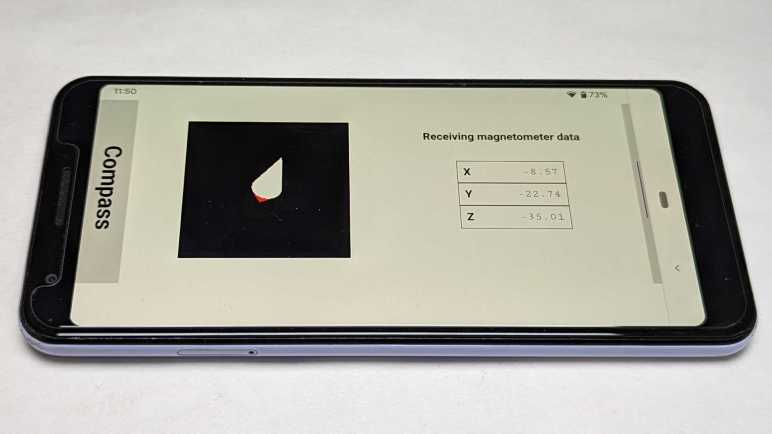
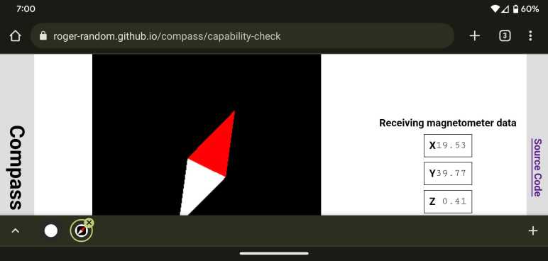
For reference, here’s my app in portrait mode and the compass needle pointing roughly north. For a phone, this is the natural orientation where “device” and “screen” would give the same information.

After rotating the phone, Chrome browser rotates my app to landscape orientation as expected. Magnetometer coordinates were also transformed, but it is pointing the wrong way!

Still Lots to Learn

These two issues are annoying because they are out of my control, but they were only a minority of the problems I encountered trying to make my little app work in landscape mode. Vast majority of the mistakes were of my own making, as I learned how to use CSS for my own layout purposes. Hands-on time makes concepts concrete, and such experience helps me when I go back to review documentation.


Source code for this project is publicly available on GitHub

Compass Web App Browser Variations

Once deployed to GitHub Pages (made easier by moving the project into its own GitHub repository) I could easily try my web app across more devices and browsers. This compass web app only really works on my Android devices with magnetometers, but the page would come up with placeholder data on every modern browser. And naturally, there are variations between browsers. The differences on iOS Safari weren’t surprising, but I was surprised at the differences between Microsoft Edge and Google Chrome as they both purportedly used the same Chromium engine.

The first and most obvious difference are update rates. All browsers would show compass needle moving in response to either real or placeholder data, but the update rate varies. On Microsoft Edge, the update rate would be on par with Chrome but would drastically slow down after several (~5) seconds without user interactivity. If I touch the needle, response rate picks back up for another few seconds before slowing down. I suspect this is a consequence of aggressive throttling of animation and/or timers in the goal of saving power.

Another difference are in page updates. One example on my is “{{magX | number:'1.2-2'}}” which is supposed to print the value of magX property to two decimal point precision. (Y and Z are handled the same way.) I update magX every time data is received, but that isn’t necessarily shown on screen. Chrome shows as expected but Edge never updates. There’s something different about how Angular runs its change detection between these two browsers. Until I understand how to work within the system, I can work around the problem by manually calling ChangeDetectorRef.detectChanges() to notify that new numbers need to be picked up.

Once I had portrait mode working more or less as intended, I started looking into landscape mode and found… uh… many more learning opportunities.


Source code for this project is publicly available on GitHub

Compass Web App Project Gets Own Repository

Once I got Three.js and Magnetometer API up and running within the context of an Angular web app, I was satisfied this project is actually going to work. Justifying a move out from my collection of NodeJS tests and into its own repository. Another reason for moving into its own repository is that I wanted to make it easy to use angular-cli-ghpages to deploy my Angular app to GitHub pages. Where it will be served over HTTPS, a requirement for using sensor API from a web app.

Previously, I would execute such moves with a simple file copy, but that destroys my GitHub commit history. Not such a huge loss for small experiments like this one, but preserving history may be important in the future so I thought this is a good opportunity to practice. GitHub documentation has a page to address my scenario: Splitting a subfolder out into a new repository. It points us to a non-GitHub utility git-filter-repo which is a large Python script for manipulating git repositories in various ways, in this case isolating a particular directory and trimming the rest. I still had to manually move everything from a /compass/ subdirectory into the root, but that’s a minor change and git could recognize the files were renamed and not modified.

The move was seamless except for one detail: there is a conflict between local development and GitHub Pages deployment in its index.html. For GitHub Pages, I needed a line <base href="/compass/"> but for local development I needed <base href="/">. Otherwise the app fails to load because it is trying to load resources from the wrong paths resulting in HTTP404 Not Found errors. To make them consistent, I can tell my local development server to serve files under the compass subdirectory as well so I can use <base href="/compass/"> everywhere.

ng serve --serve-path compass

I don’t recall this being a problem in my “Tour of Heroes” tutorial. What did I miss? I believe using --serve-path is merely a workaround without understanding the root cause, but that’s good enough for today. It was more important that GitHub Pages is up and running and I could test across different browsers.


Source code for this project is publicly available on GitHub

Magnetometer Service as RxJS Practice

I’m still struggling to master CSS, but at least I got far enough to put everything I want on screen roughly where I want them, even after the user resizes their window. Spacing and proportion of my layout is still not ideal, but it’s good enough to proceed to the next step: piping data from W3C Generic Sensor API for Magnetometer into my Angular app. My initial experiment was a much simpler affair where I could freely use global variables and functions, but that approach would not scale to my future ambition to execute larger web app projects.

Installation

The Magnetometer API is exposed by the browser and not a code library, so I didn’t need to “npm install” any code. However, as it is not a part of core browser API, I do need to install W3C Generic Sensor API type definition for the TypeScript compiler. This information is only used at development time.

npm install --save-dev @types/w3c-generic-sensor

After this, TypeScript compiler still complains that it can’t find type information for Magnetometer. After a brief search I found I also need to edit tsconfig.app.json and add w3c-generic-sensor to “types” array under “compilerOptions”.

  "compilerOptions": {
    "types": [
      "w3c-generic-sensor",
    ]
  },

That handles what I had to do, but I’m ignorant as to why I had to do it. I didn’t have to do the same for @types/three when I installed Three.js, why was this different?

Practicing Both RxJS and Service Creation

I’ll need a mechanism to communicate magnetometer data when it is available. When the data is not available, I want to be able to differentiate between reasons why that data is not available. Either the software API is unable to connect to a hardware sensor, or the software API is not supported at all. The standard Angular architectural choice for such a role is to package it up as a service. Furthermore, magnetometer data is an ongoing stream of data, which makes it a perfect practice exercise for using RxJS in my magnetometer service. It will distribute magnetometer data as a Subject (multicast Observable) to all app components that subscribe to it.

Placeholder Data

Once I had it up and running, I realized everything is perfectly setup for me to generate placeholder data when real magnetometer data is not available. Client code for my magnetometer data service doesn’t have to change anything to receive placeholder data. In practice, this lets me test and polish the rest of my app without requiring that I run it on a phone with real magnetometer hardware.

State and Status Subjects

Happy with how this first use turned out, I converted more of my magnetometer service to use RxJS. The current state of the service (initialized, starting the API, connecting to magnetometer hardware, etc) was originally just a publicly accessible property, which is how I’ve always written such code in the past. But if any clients want to be notified as soon as the state changes, they either have to poll state or I have to write code to register & trigger callbacks which I rarely put in the effort to do. Now with RxJS in my toolbox, I can use a Behavior Subject to communicate changes in my service state, making it trivial to expose. And finally, I frequently send stuff to console.log() to communicate status messages, and I converted that to a Behavior Subject as well so I can put that data onscreen. This is extra valuable once my app is running on phone hardware, as I can’t (easily) see that debug console output.

RxJS Appreciation

After a very confused introduction to RxJS and a frustrating climb up the learning curve, I’m glad to finally see some payoff for my investment in study time. I’m not yet ready to call myself a fan of RxJS, but I feel I have enough confidence to wield this tool for solving problems. This story is to be continued!

With a successful Angular service distributing data via RxJS, I think this “rewrite magnetometer test in Angular” is actually going to happen. Good enough for it to move into its own code repository.

[UPDATE: After learning more about Angular and what’s new in Angular v16, everything Idescribed in this post has been converted to Angular Signals.]


Source code for this project is publicly available on GitHub

Angular Component Dynamic Resizing

Learning to work within Angular framework, I had to figure out how to get my content onscreen at the location and size I wanted. (Close enough, at least.) But that’s just the start. What happens when the user resizes the window? That opens a separate can of worms. In my RGB332 color picker web app, the color picker is the only thing onscreen. This global scope meant I could listen to Window resize event, but listening to window-level event isn’t necessarily going to work for solving a local element-level problem.

So how does an Angular component listen to an event? I found several approaches.

It’s not clear what tradeoffs are involved using Renderer versus EventManager. In both cases, we can listen to events on an object that’s not necessarily our component. Perhaps some elements are valid for one API versus another? Perhaps there’s a prioritization I need to worry about? If I only care about listening to events that apply to my own specific component, things can be slightly easier:

  • @HostListener decorator allows us to attach a component method as the listener callback to an event on a component’s host object. It’s not as limited as it appears at first glance, as events like “window:resize” apparently propagates through the tree so our handler will fire even though it’s not on the Window object.

In all of the above cases, we’re listening on a global event (window.resize) to solve a local problem (react to my element’s change in size.) I was glad to see that web standards evolved to give us a local tool for solving this local problem:

  • ResizeObserver is not something supported by core Angular infrastructure. I could write the code to interact with it myself, but someone has written an Angular module for ResizeObserver. This is part of a larger “Web APIs for Angular” project with several other modules with similar goals: give an “Angular-y” way to leverage standardized APIs.

I tried this new shiny first, but my callback function didn’t fire when I resized the window. I’m not sure if the problem was the API, the Angular module, my usage of it, or that my scenario not lining up with the intended use case. With so many unknowns, I backed off for now. Maybe I’ll revisit this later.

Falling back to @HostListener, I could react to “window.resize” and that callback did fire when I resized the window. However, clientWidth/clientHeight size information is unreliable and my Three.js object is not the right size to fill its parent <DIV>. I deduced that when “window:resize” fired, we have yet to run through full page layout.

With that setback, I fell back to an even cruder method: upon every call to my animation frame callback, I check the <DIV> clientWidth/clientHeight and resize my Three.js renderer if it’s different from existing values. This feels inelegant but it’ll have to do until I have a better understanding of how ResizeObserver (or an alternative standardized local scope mechanism) works.

But that can wait, I have lots to learn with what I have on hand. Starting with RxJS and magnetometer.


Source code for this project is publicly available on GitHub

Angular Component Layout Sizing

For my first attempt at getting Three.js running inside an Angular web app, the target element’s width and height were hard coded to a number of pixels to make things easier. But if I want to make a more polished app, I need to make this element fit properly within an overall application layout. Layout is one of the things Angular defers to standard CSS. Translating layouts I have in my mind to CSS has been an ongoing challenge for me to master so this project will be another practice opportunity.

Right now, I’m using a <DIV> in my markup to host a canvas object generated by Three.js renderer. Once my Angular component has been laid out, I need to get the size of that <DIV> and communicate it to Three.js. A little experimentation with CSS-related properties indicated my <DIV> object’s clientWidth and clientHeight were best fit for the job.

Using clientWidth was straightforward, but clientHeight started out at zero. This is because during layout, the display engine looked at my <DIV> and saw it had no content. The canvas isn’t added until after initial layout in AfterViewInit hook of Angular component lifecycle. I have to create CSS to block out space for this <DIV> during layout despite lack of content at the time. My first effort was to declare a height using “vh” unit (Viewport Height) to stake my claim on a fraction of the screen, but that is not flexible for general layout. A better answer came later with Flexbox. By putting “display: flex;” on my <DIV> parent, and “flex-grow:1” on the <DIV> itself, I declared that this Three.js canvas should be given all available remaining space. That accomplished my goal and felt like a more generally applicable solution. A reference I found useful during this adventure was the Flexbox guide from CSS-Tricks.com.

It’s still not perfect, though. It is quite possible Flexbox was not the right tool for the job, but I needed this practice to learn a baseline from which I can compare with another tool such as CSS Grid. And of course, getting a layout up on screen is literally just the beginning: what happens when the user resizes their window? Dynamically reacting to resize is its own adventure.


Source code for this project is publicly available on GitHub

Angular + Three.js Hello World

I decided to rewrite my magnetometer test app as an Angular web app. Ideally, I would end up with something more polished. But that is a secondary goal. The primary goal is to use it as a practice exercise for building web apps with Angular. Because there are definitely some adjustments to make when I can’t just use global variables and functions for everything.

My first task is to learn how to use Three.js 3D rendering library from within an Angular web app. I know this is doable from others who have written up their experience, I only have to follow their lead.

Installation

The first step is obvious: install Three.js library itself into my project.

npm install --save three

Now my Angular app could import objects from Three, but it would fail TypeScript compilation because the compiler doesn’t have type information. For that, a separate library needs to be installed. This is only used at development time, so I save it as a development-only dependency.

npm install --save-dev @types/three

HTML DOM Access via @ViewChild

Once installed I could create an Angular component using Three.js. Inside that component I could use most of the code from Three.js introduction “Creating a Scene“. One line I could not use directly is:

document.body.appendChild( renderer.domElement );

Because now I can’t just jam something to the end of my HTML document’s <BODY> element. I need to stay within the bounds of my Angular component. To do so, I name an element in my component template HTML file where I want my Three.js canvas to reside.

[...Component template HTML...]

  <div #threejstarget></div>

[...Component template HTML...]

In the TypeScript code file, I can obtain a reference to this element with the @ViewChild decorator.

  @ViewChild('threejstarget') targetdiv!: ElementRef;

Why the “!” suffix? If we declared the variable “targetdiv” by itself, TypeScript compiler would complain that we risk using a variable that may be null or undefined instead of its declared type. This is because TypeScript compiler doesn’t know @ViewChild will handle that initialization. We use an exclamation mark (!) suffix to silence this specific check on this specific variable without having to turn on the (generally useful) null/undefined checks in TypeScript.

(On the “To-Do” list: come back later and better understand how @ViewChild relates to similar directives @ViewChildren, @ContentChild, and @ContentChildren.)

Wait until AfterViewInit

But there are limits to @ViewChild power. Our ElementRef still starts null when our component is initialized. @ViewChild could not give us a reference until the component template view has been created. So we have to wait until the AfterViewInit stage of Angular component lifecycle before adding Three.js render canvas into our component view tree.

  ngAfterViewInit() : void {
    this.targetdiv.nativeElement.appendChild( this.renderer.domElement );
  }

An alternative approach is to have <CANVAS> inside our component template, and attach our renderer to that canvas instead of appending a canvas created by renderer.domElement. I don’t yet understand the relevant tradeoffs between these two approaches.

Animation Callback and JavaScript ‘this

At this point I had a Three.js object onscreen, but it did not animate even though my requestAnimationFrame() callback function was being called. A bit of debugging pointed to my mistaken understanding of how JavaScript handles an object’s “this” reference. My animation callback was getting called in a context where it was missing a “this” reference back to my Angular component, and thus unable to advance the animation sequence.

requestAnimationFrame(this.renderNeedle);

One resolution to this issue (JavaScript is very flexible, there are many other ways) is to declare a callback that has an appropriate “this” reference saved within it for use.

requestAnimationFrame((timestamp)=>this.renderNeedle(timestamp));

That’s a fairly trivial problem and it was my own fault. There are lots more to learn about animating and Angular from others online, like this writeup about an animated counter.

Increase Size Budget

After that work I had a small Three.js animated object in my Angular application. When I run “ng build” at that point, I would see a warning:

Warning: bundle initial exceeded maximum budget. Budget 500.00 kB was not met by 167.17 kB with a total of 667.17 kB.

An empty Angular application already weighs in at over 200kB. Once we have Three.js in the deployment bundle, that figure ballooned by over 400kB and exceeded the default warning threshold of 500kB. This is a sizable increase, but thanks to optimization tools in the Angular build pipeline, this is actually far smaller than my simple test app. My test app itself may be tiny, but it downloaded the entire Three.js module from a CDN (content distribution network) and that file three.module.js is over a megabyte (~1171kB) in size. By that logic this is the better of two options, we just have to adjust the maximumWarning threshold in angular.json accordingly.

My first draft used a fixed-size <DIV> as my Three.js target, which is easy but wouldn’t be responsive to different browser situations. For that I need to learn how to use CSS layout for my target <DIV>


Source code for this project is publicly available on GitHub

Compass Web App for Angular Practice

I’ve wanted to learn web development for years and one of my problems was that I lacked the dedication and focus to build my skill before I got distracted by something else. This is a problem because web development world moves so fast that, by the time I returned, the landscape has drastically changed with something new and shiny to attract my attention. When I window-shopped Polymer/Lit, I was about to start the cycle again. But then I decided to back off for a few reasons.

First and most obvious is that I didn’t yet know enough to fully leverage the advantages of web components in general, and Polymer/Lit in particular. They enable small lightweight fast web apps but only if the developer knows how to create a build pipeline to actually make it happen. I have yet to learn how to build optimization stages like tree-shaking and minimization. Without these tools, my projects would end up downloading far larger files intended for developer readability (comments, meaningful variable names, etc.) and include components I don’t use. Doing so would defeat the intent of building something small lightweight.

That is closely related to the next factor: Angular framework has a ready setup of all of those things I have yet to master. Using Angular command line tools to build a new project boilerplate comes with a build pipeline that minimizes download size. I wasn’t terribly impressed by my first test run of this pipeline, but since I don’t yet know enough to setup my own, I definitely lack the skill to analyze why and certainly don’t yet know enough to do better.

And finally, I have already invested some time into learning Angular. There may be some “sunk cost fallacy” involved here but I’ve decided I should get basic proficiency with one framework just so I have a baseline to compare against other frameworks. If I redirect focus to Polymer/Lit, I really don’t know enough to understand its strengths and weaknesses against Angular or any other framework. How would I know if it lived up to “small lightweight fast” if I have nothing to compare it against?

Hence my next project is to redo my magnetometer web app using Angular framework. Such a simple app wouldn’t need all the power of Angular, but I wanted a simple practice run while things are still fresh in my mind. I thought about converting my AS7341 sensor web app into an Angular app, but those files must be hosted on an ESP32 which has limited space. (Part of the task would be converting to use ESPAsyncWebServer which supports GZip-compressed files.) In comparison, a magnetometer app would be hosted via GitHub pages (due to https:// requirement of sensor API) and would not have such a hard size constraint. Simpler deployment tipped the scales here, so I am going with a compass app starting with putting Three.js in an Angular boilerplate app.


Source code for this project is publicly available on GitHub
Notes After Xbox One X SSD Upgrade

The major reason I upgraded from Xbox One to Xbox One X was for 4K UHD resolution. And the main reason I upgraded from Xbox One X to Xbox Series X was for its SSD. Now that I’ve retrofitted an SSD to my Xbox One X, is it just as good as a Series X? The answer is no. Xbox Series X still vastly outperforms the Xbox One X even with SSD.

Even Faster Loads

As a representative data-intensive task, I loaded up Forza Horizon 4 and traveled between the main content area (UK mainland) and one of the expansions (LEGO island.) Xbox One X on its original HDD required about 44 seconds to switch maps. Now that it has an SSD, load time has been cut by more than half to 21 seconds. A great improvement but pales in comparison to Xbox Series X which takes only 14 seconds to make the same transition. I’m not sure how much of that is the faster NVMe-based data bus for Series X SSD and how much is its faster processor, but it’s clearly and measurably faster. 44 seconds is long enough to get up from the couch and get a beverage, 14 seconds is barely long enough to pick up my phone to check messages. As this was one of the lengthier transitions in the game, in practice it means I’m rarely left waiting on a Series X while playing.

Quick Resume

Xbox Series X is superior to One X in many other ways, I’m enamored with its higher framerate which arrived simultaneous with HDMI spec to take advantage of it. I even bought a TV to go with Series X, a LG OLED with beautiful picture and terrible software. But back to the subject of load times: “Quick Resume” is a new feature. It suspends a game when the user switches away and, when the user is ready to pick up that game again, reloads the suspended data. Xbox One X required about a minute to start Forza Horizon 4 from stock HDD. With my SSD upgrade, FH4 loads in about half the time: 31 seconds. And that’s only up to the introduction screen, it takes another ~60 seconds (HDD) / ~30 seconds (SSD) before I’m driving. In contrast a Series X with Quick Resume can take me from home screen and into the driver’s seat in about 8 seconds. I find this absolutely astonishing and I’m a huge fan of this new feature.

TRIM

A final note on storage: I don’t know if Xbox One X issues TRIM commands to the SSD as data come and go. This was important for SSD longevity (Wikipedia has more details) and requires operating system support. Since it never came with a SSD, there’s no reason for Xbox One X to issue TRIM commands. On the other hand, low level disk code is probably shared between all Xbox variants, including the SSD-equipped Series S and Series X that would benefit from TRIM. And since TRIM is ignored by older drives that don’t understand it, there’s no reason for them to put in extra effort to disable TRIM on older consoles. And finally, various manufacturers (including Crucial who made the drive now living in my One X) claim that their SSD firmware is now advanced enough they don’t need TRIM to obtain optimal performance. I’m not sure I believe that, and I don’t know of any way to tell if TRIM is happening, but SSDs are now cheap enough I’m willing to continue this experiment.

Xbox One X SSD Upgrade

Using Linux disk tool “dd” I successfully migrated data on my Xbox One HDD to an SSD with identical capacity. The SSD upgrade made the nine-year old console much more responsive to game loading and in-game navigation, incurring less waits before the action starts. (It didn’t do anything once the game is up and running, obviously.) With this success, I eyed its successor: my Xbox One X which is also gathering dust since the time I upgraded to the latest Xbox Series X.

The SSD-upgraded Xbox One was mostly just for fun, as it is still likely to sit on a shelf collecting dust after its SSD upgrade. In contrast, an SSD-upgraded Xbox One X may actually see some use. Or at least this was the justification I used to spend money on a 1TB Crucial MX500 SSD (*) for this project. I also skipped the system reset this time around, curious to see if it makes a difference. As for a quick-and-dirty performance benchmark, I timed the duration between selecting “Restart Console” to the time I’m back at the Xbox home menu. On the factory hard drive, that took 90 seconds.

iFixit doesn’t have an explicit guide for HDD replacement on an Xbox One X (referred to by its codename Project Scorpio) but it does have a guide for BD-ROM drive replacement. Looking at pictures, I judged that was close enough as the HDD is right next to the BD-ROM drive. Once I followed instructions to reach the BD-ROM drive, I could indeed lift the hard drive cage to access four screws necessary to remove the original drive.

Disk capacity details as shown by command “fdisk -l”:

Disk /dev/sdb: 903.57 GiB, 970199064576 bytes, 1894920048 sectors
Disk model: ST1000LM035-1RK1
Units: sectors of 1 * 512 = 512 bytes
Sector size (logical/physical): 512 bytes / 4096 bytes
I/O size (minimum/optimal): 4096 bytes / 4096 bytes

The Crucial MX500 SSD is slightly larger, allowing me to copy all the bytes and leave almost 30GB available for wear levelling and other SSD housekeeping.

Disk /dev/sdc: 931.51 GiB, 1000204886016 bytes, 1953525168 sectors
Disk model: CT1000MX500SSD1
Units: sectors of 1 * 512 = 512 bytes
Sector size (logical/physical): 512 bytes / 4096 bytes
I/O size (minimum/optimal): 4096 bytes / 4096 bytes

This time I’m going to use a 512KB block size for dd. That may have been the key to faster copy, as the drives are double the size yet copied in less time than for Xbox One’s 500GB drive.

~$ sudo dd if=/dev/sdb of=/dev/sdc bs=512K status=progress
970164011008 bytes (970 GB, 904 GiB) copied, 9115 s, 106 MB/s
1850507+1 records in
1850507+1 records out
970199064576 bytes (970 GB, 904 GiB) copied, 9120.85 s, 106 MB/s

Reassembling the console, I retested the “Restart Console” scenario. It took just 49 seconds with the new SSD compared to 90 seconds with the HDD. Almost half the wait or in other words, almost doubled the speed! This is awesome, and I didn’t have to reset the console, but there may be an asterisk or two quantifying this success.


(*) Disclosure: As an Amazon Associate I earn from qualifying purchases.

Xbox One SSD Upgrade Successful

Following directions published by iFixit, I successfully pulled the original factory hard drive from my Xbox One (2013) game console. This is an attempt to increase game load performance with an SSD upgrade, migrating Xbox operating system files via Linux “dd” tool. I installed both original Xbox 500GB hard drive and candidate replacement 500GB SSD in my Ubuntu tower case with drive cage that makes drive install/uninstall much easier. Now I can see how they compare.

I expected both of their “500GB” to be rounded-off values approximating actual drive capacity, which are dictated by implementation details of each drive. Since they are built within constraints of completely different technologies, I expected the two drives to be somewhat different in capacity. Most of the time, a few megabytes bigger or smaller wouldn’t make a big difference. But for a blind copy to succeed, my SSD must be at least as large as the HDD. If the SSD is even one byte smaller, the blind copy would fail.

Here’s the drive removed from Xbox and installed in my Ubuntu tower, as per “fdisk -l” command.

Disk /dev/sdb: 465.76 GiB, 500107862016 bytes, 976773168 sectors
Disk model: WDC WD5000LPVX-2
Units: sectors of 1 * 512 = 512 bytes
Sector size (logical/physical): 512 bytes / 4096 bytes
I/O size (minimum/optimal): 4096 bytes / 4096 bytes

And here is my candidate for replacement SSD. It was bought a few years ago, from Western Digital’s economy class “Blue” line. This model number WDBNCE5000P is no longer available, its current-day successor to the title of “WD Blue 500GB SATA” appears to be model WDS500G3B0A (*)

Disk /dev/sdc: 465.76 GiB, 500107862016 bytes, 976773168 sectors
Disk model: WDC  WDBNCE5000P
Units: sectors of 1 * 512 = 512 bytes
Sector size (logical/physical): 512 bytes / 512 bytes
I/O size (minimum/optimal): 512 bytes / 512 bytes

Oh wow, capacity of these two drives matched perfectly down to the byte. I didn’t expect that. Was this pure coincidence or is there some other factor at play? I noticed both are Western Digital drives, did that help? No matter, I took the perfect capacity match as green light to proceed and launched my blind copy with the following command:

sudo dd if=/dev/sdb of=/dev/sdc bs=4K status=progress

It took a little over three hours to copy because hard drive throughput dropped as copy progressed. It started at well over 100 megabytes per second, but towards the end it was barely copying 1-5 megabytes a second. I don’t know why. Disk fragmentation was the only hypothesis I had, and that shouldn’t be an issue in a blind copy. My best guess is that 4 kilobytes is not the optimal block size despite it listed as “optimal” I/O size above.

I connected everything together, many components loosely dangling, and pressed the power button. 38 seconds later, I saw the initial setup screen. That’s almost half of HDD boot time of 64 seconds! I connected to my Microsoft account and retrieve a few of my digital purchases, which all ran without complaint. And even better, the SSD made this a much more responsive Xbox console. It didn’t make a difference once a game was up and running, but the SSD helps us get into the game or switch levels much faster. Less waiting, more gaming! This was a win and it emboldened me to perform an SSD upgrade with my Xbox One X as well.


(*) Disclosure: As an Amazon Associate I earn from qualifying purchases.

Xbox One Hard Drive Extracted

I’m taking apart my Xbox One (2013) for two potential projects: first is to see if I can improve its performance by upgrading its spinning platter hard drive to a flash memory solid state drive. The second is to take a look at the components within to see if I can build a slimmer “Luggable” Xbox gaming console.

On the hardware side, I referred to iFixit guide for replacing an Xbox One HDD. The guide also linked to information on how to format and partition the new drive, but I’m not going to mess with the file system. My preparation consisted of telling the Xbox to do a system reset and clear all of my personal data off the drive, just in case I make a mistake. I hope it also increases the odds of success. Some people who have tried messing with Xbox system partitions reported problems that may have been correlated to having an active account on the system. Maybe data on disk are encrypted with information related to the account? I don’t know and I’m not going to mess with it. I’m starting with a fresh slate.

After I reset the system, but before I tried opening it up, I timed the boot-up sequence. There were 64 seconds between the time I pressed power button to the initial setup screen. I will use this as my benchmark for SSD performance impact.

While following iFixit excellent directions taking the case apart, I see my biggest challenge for a “Luggable Xbox”. Its front panel controls are on a thin sheet of printed circuit board. Including eject button for the now-dead optical drive (don’t care) tactile button to pair a controller (important) and capacitive touch power button (very important). This custom piece of flexible circuit is securely encased inside the front panel, composed of multiple pieces of hard plastic held together with melted rivets. Freeing without damage would be difficult, and capacitive touch calibration is sensitive to surrounding environment. If I remove it from this panel, the power button touchpad may never work again. These are risks I have to keep in mind if I want to build an alternative enclosure.

Putting “Luggable Xbox” project idea aside for today, I finished extracted the original hard drive to see if it is compatible with my SSD upgrade candidate.

Opening Up My Xbox One

Learning how to configure automated updates in Ubuntu was just the latest adventure in open-source operating system, every adventure a chance to learn something new. And now for something completely different: the locked down black box of an Xbox One game console. This is an Xbox One, no “S” or “X” suffix, the design that launched just before 2013 holiday season bundled with a Kinect 2.0 sensor bar.

I’ve been curious about whether an SSD upgrade might transform an old Xbox One the same way SSDs could transform old Windows PCs. Unfortunately, the locked-down nature of a game console makes this more troublesome than a PC. I didn’t want to mess with Xbox disk contents which have been obfuscated in the interest of tamper-proofing the system. My best bet is to perform a low-level sector-by-sector copy to transfer bits directly from HDD to SSD. A blind copy has the highest prospect of success, but it comes with caveats:

  1. We can’t tell valid data from unused space. Absent this knowledge, every bit is equally important and must be copied. The SSD must be at least as large as the HDD to hold everything.
  2. Without knowledge of partitioning schemes, we can’t update them. Thus Xbox games would be unable to take advantage of any extra space. (It’s not wasted, technically speaking, as extra flash memory would be useful for wear leveling and similar SSD housekeeping.)

Given the space requirements, I would need a 500GB SSD to replace the 500GB HDD in my Xbox One. A few years ago, it would have been far too much money to spend just for laughs. Too expensive to just leave sitting in an old game console. I had to wait until SSDs got cheap enough for me to upgrade other machines and let the chain of hand-me-downs free up a 500GB drive for exploration. Fast forward to today, where name-brand high performance 1TB SSDs can be found for well under $100 USD. Plus, I also recently learned to perform low level copy in Linux. All the required pieces are now in place.

I also had another motivation to take apart my Xbox One and look inside. I thought it would be fun to build a “Luggable Xbox” from the guts of this machine and wanted to investigate its components. The optical drive has failed, so I wanted to remove it. Could I design and make a slimmer box to contain what’s left?

With those two goals in mind, I started taking my Xbox One apart.

Window Shopping: GMKtec NucBox3 Mini PC

A Newegg advertisement sent me down a rabbit hole of tiny little desktop PCs with full x86-64 processors. I knew about Intel’s NUC, but I hadn’t realized there was an entire product ecosystem of such small form factor machines built by other manufacturers. The one that originally caught my attention was distributed by several different companies under different names, I haven’t figured out who made it. But that exploration took me to GMKtec which is either their manufacturer, or a distributor with a sizable collection of similar products built by different manufacturers. The product that originally caught my attention is listed as their “NucBox5” (company website listing and Amazon link *) but I actually found their “NucBox3” (company website listing and Amazon link *) to be a more interesting candidate for my Sawppy Rover’s ROS brain. Both products have a Gigabit Ethernet wired networking port that I demand for resistance against RF interference, but beyond that, their respective designs differ wildly:

First the bad news: the NucBox 3 has an older CPU, the Celeron J4125 instead of the Celeron N5105. But comparing them side-by-side, it looks like I’d be giving up less than 10% of peak CPU performance. There is a huge (~50%) drop in GPU performance, but that doesn’t matter to Sawppy because most of the time its brain wouldn’t even have a screen attached.

A longer list of good stuff balances out the slower CPU:

  • RAM on the NucBox 3 is a commodity DDR4 laptop memory module. That can be easily upgraded if needed, unlike the soldered-in memory on the NucBox 5.
  • They both use M.2 SSDs for storage, but the NucBox 3 accommodates popular 2280 form factor instead of a less common 2245 size used by NucBox 5.
  • The SSD advantage was possible because NucBox 3 has a different shape: is wider and deeper than a NucBox 5, but not as tall. Designed for installation on a VESA 100×100 mount, it will be easier to bolt onto a rover chassis.
  • Officially, NucBox 3 is a fan-less passively cooled machine whereas the NucBox 5 has a tiny little cooling fan inside. (Which I expect to be loud, as tiny cooling fans tend to be.) Given that these are both 10W chips, I doubt NucBox 3 has a more effective cooling solution, I think it is more likely that the design just lets the chip heat up and throttle itself to stay within thermal limits. This would restrict its performance in stock form, but it also means it’ll be easy for me to hack up a quiet cooling solution if necessary.
  • NucBox 5 accepts power via USB-C, which is getting easier and easier to work with. I foresaw no problems integrating it with battery power onboard a Sawppy rover. But the NucBox 3 has a generic 5.5mm barrel jack for DC input power, and I think that’ll be even easier.

A NucBox3 costs roughly 80% of a NucBox5 for >90% of the performance, plus all of the designed tradeoff listed above are (I feel) advantages in favor of the NucBox3. I’m sold! I placed an order (*) and look forward to playing with it once it arrives.


(*) Disclosure: As an Amazon Associate I earn from qualifying purchases.

Window Shopping: Mystery Mini PC of Many Names

An interesting item came to my attention via Newegg marketing mailing list for discounts: an amazingly tiny Windows PC. My attention was captured by listing picture showing its collection of hardware ports. Knowing the size of an Ethernet port and HDMI port we can infer this is an itty-bitty thing. Newegg’s specific sale item was generically named “Mini PC” with an asking price of $200. I’m not entirely sure the thing is real: all the images look perfect enough I couldn’t tell if they’re 3D renderings or a highly retouched product photos.

I looked at the other listings by the same vendor “JOHNKANG” and saw several other generically named devices ranging from laptops to external monitors. There were no other similar products, so I think JOHNKANG is a distributor and not the manufacturer of this palm-sized wonder. If JOHNKANG is a US distributor for such merchandise, I guessed they probably have an Amazon listing as well. Sure enough, they have it listed on Amazon also at $200(*) at time of writing. Unlike the Newegg listing, the Amazon listing included this exploded-view diagram showing internals and capabilities.

That’s… pretty darned good for $200! With an Intel Celeron N5105 processor, I see a machine roughly equivalent to capabilities of a budget laptop but without the keyboard, screen, or battery. Storage size is serviceable at 256GB and can be swapped out with another M.2 SSD, though in a less common 2242 format which is shorter than the popular 2280. Its 8GB of RAM are soldered and not easily expandable, but 8GB is more than sufficient for this price point.

A few features distinguish this tiny PC from equivalent-priced laptops, starting with its dual HDMI port where laptops only have one. That might be important for certain uses, but I’m more interested in its wired Gigabit Ethernet port and that it runs on USB-C power input. This machine appears to check off all of my requirements for a candidate Sawppy Rover brain. It’s a pretty good candidate for running ROS slotting just below an Intel NUC in capability but compensates for that with a lower price and smaller physical size. Heck, at this size it is starting to compete with Raspberry Pi and might even fit in a Micro Sawppy.

I found no make or model number listed, which is consistent with a distributor that really doesn’t want us to comparison shop against anyone else who might be distributing the same product for less money. If I want hard details, I might have to buy one and look over the hardware for hints as to who built it. Still, searching for “Mini PC” and “MiniPC” with N5105 CPU found this eBay listing of a used unit with Rateyuso branding. Then I found this AliExpress listing with ZX01 as model name. That AliExpress listing is a mess, showing pictures of several other different mini PCs. Not confidence inspiring and definitely turned me off of buying from that vendor. However, the “ZX01” model name was useful because it led me to this page, which linked to a Kickstarter project that has apparently been taken down due to intellectual property dispute.

Performing an image search using the suspiciously perfect picture/render found the GMKtec Nucbox5(*) which appears to be the same product but with “GMKtec” stamped on top. Looking at the Amazon storefront for GMKtec (*) I see many other small form factor PCs without any family resemblance between their industrial designs. My hypothesis is that GMKtec is a distributor as well, but they have built up a collection of products from different manufacturers and that’s why they all look different. I thought this was encouraging. It implies experience and knowledge with the ecosystem of tiny PCs, offering a breadth of products each making a different tradeoff. I looked over their roster and found one more to my taste.


(*) Disclosure: As an Amazon Associate I earn from qualifying purchases.

Web Dev Alphabet Soup: CORS and CSRF

After a helpful comment helped me find documentation on the no-longer-mysterious AS7341 SMUX (sensor multiplexor) I went to learn more about another mystery I stumbled across as a beginner web developer: CORS (cross-origin resource sharing.) Why does CORS policy exist? After a bit of poking around, I believe the answer is to mitigate a type of attack under the umbrella of CSRF (cross-site request forgery.)

When developing my AS7341 web app, I had the AS7341 accessible via a HTTP GET on my ESP32 and thought I could develop the HTML interface on my desktop machine. But when my desktop-served JavaScript tried to query my ESP32, I was blocked by browser CORS policy. By default, JavaScript served from one server (my desktop) is not allowed to query resources on another (my ESP32.)

Reading various resources online, I learned I could set my ESP32’s HTTP response header “Access-Control-Allow-Origin” to a wildcard “*” to opt out of CORS protection. But that’s merely a “make the error go away” kind of recommendation. I know CORS is security related, but I don’t understand the motivation. What security problem does CORS prevent? Without knowing the motivation, I don’t know what I am opening up by setting “Access-Control-Allow-Origin : *” In my web app, I started out cautiously by only setting that header when I’m developing the HTML UI, serving from my desktop to query my ESP32. In “production”, my ESP32 will serve the HTML and would not need “Access-Control-Allow-Origin : *” in the header to query itself, so that header is absent.

Is that the right thing to do, or is that being overly cautious? I set out to learn more. Curiously, reading MDN and other resources give me information about HOW CORS works, but not a lot about WHY CORS exists. I guess CORS documentation assume the reader already knows! Based on that fact, I know I am looking for a relatively common website security issue that is now considered basic knowledge by network professionals.

Another data point is the fact that CORS is only applicable to HTTP queries from JavaScript running in the browser. From a command line on my desktop, I can use the “curl” tool to query my ESP32 and CORS does nothing to block that. My browser on my desktop can query the endpoint directly and that is not blocked by CORS policy, either.

Things didn’t make much sense until I found a key piece of information: HTTP request sent from a browser’s JavaScript runtime not only sends the URL and its parameters, but the browser would also attach all cookies set by that host. These cookies may contain user authentication (the “Keep me logged in” checkbox) and it makes sense such capability shouldn’t be available to just any piece of JavaScript served by random hosts. Knowing this fact and knowing the kind of abuse such code can cause eventually led me to a category of security attacks known as CSRF (cross-site request forgery.)

Once I understood CORS is here to mitigate a subset of CSRF attacks, I could look at my ESP32 AS7341 access endpoint and decide CSRF is not a problem here. Setting “Access-Control-Allow-Origin : *” does not open me up to security nastiness, so my ESP32 sketch sets that header all the time now not just during development. This is a handy bit of knowledge, but it merely scratched the surface of web security. Another item I found to be big and intimidating is OAuth.


Code for this project is publicly available on GitHub

AS7341 Project Postscript: SMUX Mystery Solved

I’ve wrapped up version 1.0 of my AS7341 interaction web app project with some ideas for future improvements, but I learned of a big one after I wrote up my project. When an earlier post in my AS7341 series “Sample Code Gave Incomplete Picture of AS7341 SMUX Configuration” was published, there was a comment by [Sebastian] telling me that I’ve overlooked the “Tools & Resources” tab of AMS AS7341 product page.

[Sebastian] is correct! There were several large ZIP file downloads under “Resources” of type “Evaluation Software”. Their descriptions line up with several AMS demos for this sensor. I probably dismissed them as irrelevant as I don’t have the corresponding AMS concept demonstration hardware. But [Sebastian] didn’t make the same mistake. Thanks to his investigation, I’ve been prompted to look inside and found that, in additional to demo-specific resources, there are subdirectories with reference resources including everything I complained was missing:

  • Windows application installer, likely for AMS AS7341 GUI software mentioned in calibration Application Note. (I didn’t install on my own computer.)
  • Excel spreadsheet also mentioned in calibration Application Note.
  • Calibration Application Note along with a few other Application Notes.
  • Most importantly: an Application Note on SMUX configuration details!

The gold nugget found within the ZIP file is AMS Application Note AN000666. “SMUX Configuration: How to Configure SMUX for Reading Out Results.” The precise location probably varies from file to file, but for the file I examined (AS7341_EvalSW_ALS_v1-26-3) it was under subdirectory “Documents”/”application notes”/”SMUX”

The key piece of information I had been missing earlier is the concept of mapping AS7341 sensor array to pixel IDs. These pixel IDs are not sequential or regular in any pattern I can decipher, and many pixel IDs are unused. I suspect these ID assignments made sense for reasons important to the engineering team that laid out this implementation on silicon wafers. Between their seemingly random order and the fact roughly half of the IDs were just unused, it was no wonder I failed to reverse-engineer this information from sample code.

But with this Application Note as reference, we now have information in hand to create SMUX configurations to best suit future projects. This is wonderful. Thanks, [Sebastian]! It’s a weight off my shoulders as I proceeded to learn about other mysteries.