
I’ve been digging through the sample for Getting Started with Angular Signals code lab and learned a lot beyond its primary aim of teaching me Angular Signals. But a beginner could only absorb so much. After learning a whole bunch of things including drag-and-drop with the Angular CDK, my brain is full. I need to get back to hands-on practice to apply (some of) what I’ve learned and cement the lessons. Which means it’s time for my Angular practice app Compass (recently upgraded to Angular 16) to use Angular Signals!
In my practice app, I created a service to disseminate magnetometer sensor information. It subscribed to the relevant W3C sensor API and publishes data via RxJS BehaviorSubject. I didn’t know it at a time, but I had effectively recreated a Signal using much more powerful (and heavyweight) RxJS mechanisms. One by one I converted to broadcast data via signals: magnetometer x/y/z data, magnetometer service status (user-readable text string), and finally service state (an enumeration). I also removed the workaround of making an explicit call to Angular change detection. I never did understand why I needed it under Mozilla Firefox and Microsoft Edge but not under Google Chrome. But after switching to Angular signals, I had different change detection problems to investigate.
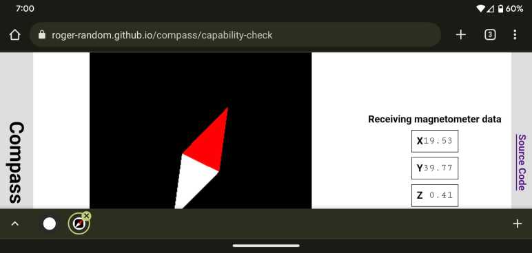
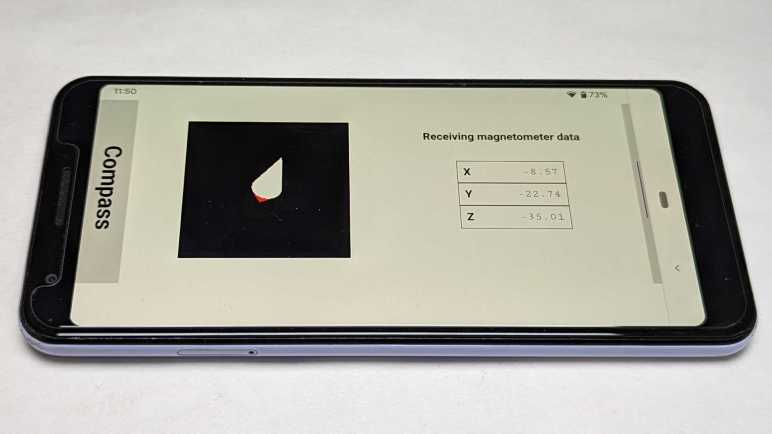
The switchover greatly simplified my application code, making it much more straightforward to read and understand. Running in a browser on my development desktop computer, I didn’t have real magnetometer data but my placeholder data stream (sending data to the same signals) worked well. Making me optimistic as I deployed, and then surprised when I failed to see magnetometer data updates on an Android phone.
Since the failure was specific to the device, it was time for me to set up Chrome remote debugging for my phone. My development desktop has Android Studio installed, so all of the device drivers for hardware debugging were in place. Following instructions on the Chrome documentation page DevTools/Remote Debugging, I established a connection between Chrome DevTools on my desktop and Chrome on my phone. Forwarding port 4200 for my Angular development server, I could load up a development mode version of my app for easier debugging. Another advantage was that it’d show up as http://localhost:4200. The magnetometer sensor API is restricted to web code served via https:// but there’s an exemption for http://localhost for debugging as I’m doing.
I was happy to find the Chrome DevTools advertised at Google I/O worked very well in practice: there is a source map allowing me to navigate execution in terms of my Angular TypeScript source code (versus the transpiled JavaScript) and I could use logpoints to see execution progress without having to add console.log() to my app. Thanks to those lovely tools I was able to quickly determine that magnetometer reading event handler was getting called as expected. That callback function called signal set() with new data, but those signals’ dependencies were never called. I had two in Compass: numerical text in HTML template to display raw coordinates onscreen, and code to update position of compass needle drawn via three.js.
Just like earlier, I had a problem with Angular Signals code not getting called and breakpoints can’t help debug why calls aren’t happening. I reviewed the same documentation again but gained no insights this time. (I have the proper injection context, so what now?) Experimenting with various hypothesis, I found one hit: there’s something special about the calling context of a sensor reading event handler incompatible with Angular signals. If I add a timed polling loop calling the exact same code (but outside the context of a sensor callback) then my magnetometer updates occur as expected.
This gives me a workaround, but right now I don’t know if this problem is an actual bug with Angular Signals or if it is merely hacking over a mistake I’ve made elsewhere. I need more Angular practice to gain experience to determine which is which.
Source code for this project is publicly available on GitHub.


 New Screwdriver