Fusion 360 vs. Onshape: Multiple Views

Advantage: Onshape.

When working on a CAD project, the majority of my time is spent focused on a single view of my subject. But when it comes to align parts into an assembly, it is very useful to have multiple views, and this is where Fusion 360 falls behind Onshape.

Fusion 360 can toggle between the standard single-view mode and a quad-view mode. In quad-view mode, the window starts with four equal-sized views and the user can adjust the relative sizes within the window.

F360MultiView

This is a bare-bones baseline level of functionality. I can work with it, but I’m not happy with it. Onshape does it better.

Onshape takes advantage of the fact it runs in a browser. You can have multiple browser windows open on the same Onshape project, and each window can be a different view. Onshape infrastructure keeps all the windows in sync – any change made in one view is immediately reflected in all the others. Want four views? Open four windows. Want 6 views? (top/bottom/left/right/front/back) Open six windows.

And since these Onshape views are all separate windows, they can be placed on different monitors to build a great multi-monitor workspace. Fusion 360 is limited to a single window. Trying to use Fusion 360 across multiple monitors means manually scaling the application window across them. Toolbars get cut in half, resolution doesn’t match, problems left and right. It is not ideal.

What about opening multiple instances of Fusion 360, one for each monitor? It turns out that doesn’t work because the instances are unaware of each other. Change made in one instance is not reflected in the others until the user hits “Save” in one instance and “Reload” in all the other open instances.

The obvious conclusion is that Fusion 360 works best on a single high-resolution display instead of multiple screens. Sadly this is also false. As mentioned in my first Fusion 360 vs. Onshape comparison, Fusion 360 does not scale to high-resolution displays (4K, Retina, etc.) whereas Onshape takes advantage of the fact browser makers have long since handled the problem of scaling for high resolution.

Since the time of my first comparison Autodesk knowledge base published a workaround for running Fusion 360 on high-resolution displays. With these workarounds, Fusion 360 now runs poorly at 4K, which I guess is an improvement over not running at all.

With more multi-view options, including multi-monitor, plus superior support for high-resolution displays, Onshape handily wins this comparison, and they know it.

Luggable PC Project Complete!

The Luggable PC project page on Hackaday.io has been fully documented for anybody to build their own home-built 3D-printed computer chassis. All the components required for assembly have been listed, and all the steps of assembly documented with pictures taken at each and every step.

I expect to continue to make small tweaks to the design, improving little things here and there, but the machine is usable enough that I should stop tinkering with it and actually start using it. This means no new versions rebuilt from scratch for the foreseeable future. But if inspiration strikes, there will be!

When I’ve taken my Luggable PC to various maker events in the local area I’ve received generally positive reception and appreciation. Now I wait to see if anybody actually takes me up on the information compiled and build their own.

LuggablePCAssembly640

Luggable PC Drive Bay Revisions

Here’s the 2.5″ drive bay in the initial iteration of the threaded-box Luggable PC design. It is a simple, basic place to hold one laptop-sized drive, but not a very efficient use of space.

IMG_20170228_090310 - Copy

The most obvious thing to do is to vertically stack another drives adjacent to the existing drive. Easy to do in CAD, but has problems in the real world.

Problem 1: How do you access the fasteners? The laptop storage market have mostly settled around two basic fastener schemes: four screws on the bottom of the drive, or four screws along the sides. If we use the side fasteners, they would not be accessible for drive replacement without taking the whole case apart. The bottom fasteners would be accessible, except that bracket would be impossible to print on a FDM 3D printer.

Problem 2: How do you connect the wires? While at first glance there is enough space to physically accommodate the drive and its plugs, it fails to take into account the wires. The wires for the existing drive barely clear the edge in the picture. Stacking another drive into that space (even if moving it another cm or two to the right) would demand wires make relatively sharp right-angle turns. This would place strain on the connectors including the fragile unsupported SATA connectors on the drive itself.

After some experimentation with the available space, keeping in mind the requirements above, I decided to angle the two stacked drives:

IMG_20170228_091421 - Copy

Now the Luggable PC has two independent drives: One for Windows 10, and another for Ubuntu Linux 16.10.

This design solves the fastener issue: in this arrangement, it is possible to 3D print the drive bay so both drives are held in place by the shape without use of any screws on the sides or on the bottom. Both drives are held in place by a single 3D printed clamp that is secured with just two screws. The downside is that the design only works when both drives are present. It is unable to hold a single drive in place.

This also solves the initial wiring issue: By angling both drives, the wires do not have to make sharp turns and would not place unreasonable strain on the connectors. However, this comes at a cost of usable interior volume. By angling the connectors, and avoiding sharp turns, the cables consumed more precious interior volume than the previous design.

Going back to the idea of drives stacked in the available volume, we revisit the problem of forcing wires to make sharp turns. The turns can be relaxed if we can find more room for the wires without angling it into precious interior volume. The solution turned out to be… turning the drives instead! By rotating 90 degrees a drive can be positioned to make room for the cables’ turns. It also allows two drives to exist side-by-side, allowing the bay to work with a single drive or dual drives.

This design was incorporated into the following iteration of the chassis, built using aluminum extrusions instead of threaded rods as the metal structure.

DriveBayV3


Luggable PC Feet Design Considerations

After some time using the assembled Luggable PC prototype, I wanted to adjust the screen ergonomics. While the screen has been raised to a height much more comfortable compared to a laptop, after a few hours of use I wished I could tilt the screen upwards a few degrees.

At first glance this would have been impractical – the screen hinge design is already complicated and adding a tilt adjustment mechanism would only make it more so. So instead of tilting the screen, let’s achieve the goal by tilting the entire Luggable PC by adding 3D printed feet that can be bolted to the bottom of the machine.

The easiest approach would have been to print a simple solid wedge with the desired angle, but I decided to be a little more experimental. I played with Fusion 360’s spline tool to sketch out feet that are designed to move and flex a tiny bit. The flexibility adds two features:

  1. Shock absorption: We still need to be careful setting it down on a surface, but the minute bit of flexibility we gain will help cushion the harshest part of initial impact and make it feel less like we’re breaking the machine every time we set it down.
  2. Flatness compensation: With a bit of flexibility in the feet, the Luggable PC can now conform to surfaces that are not perfectly flat. Previously, the solid bottom means it will rock on 3 out of 4 feet on any surface that isn’t perfectly flat (which is most of them.)

Here is the first iteration, which accomplishes the desired goals:

IMG_20170228_173547 - Copy

Unfortunately it also has a problem: by moving the contact points inward, the front feet are now uncomfortably close to the center of gravity. A slight push from the rear will send the whole thing toppling forward. The design needs to be adjusted to have a wider stance… but we are constrained by the fact the fastening nuts still need to be accessible.

In this case, the short-term fix is to move the feet as far front as possible while still allowing wrench access to fasteners.

IMG_20170228_174620 - Copy

The real solution is to redesign the bottom of the case to accommodate the feet while maintaining a sufficiently wide stance. This idea was incorporated into the following iteration of the Luggable PC. As it used aluminum extrusions for backbone instead of threaded rods, the new wider feet were installed on the bottom extrusion.

FeetV3

A Tale of Three Corners: Design Evolution

The use of threaded rods to hold the Luggable PC case together was borne out of necessity: The print volume of the 3D printer is much smaller than the volume of a PC case so it must be printed in pieces then fastened together. A threaded rod provides strength along its length, but how do we best handle the inevitable corners?

The key constraint is the strength of a 3D printed part, especially the adhesion between layers. This is an unavoidable fact of life for FDM-type printers: the part is weakest between layers, so designing for 3D printers must consider the layers similar to how designing for wood must consider the grain.

Version 1: basic asymmetric

In this design (as used in the “Easel PC” iteration) two of the rod axis are aligned with the direction of the layer. Stress along those two axis would mostly be held in check by the strength within each layer, but a fraction of the force would try to push the layers apart. To guard against this, the third axis is orthogonal so its fastening nuts would also try to hold the layers together.

Corner 1 B
Two of the rods are co-planar with the print layer. (Rod pointing left, and rod pointing down.) The nuts fastening the third rod (Rod pointing away) also exerts a clamping force on the layers.
Corner 1 A
Same hinge viewed from a different angle.

The problem with this design is that the corners are asymmetric by nature. Not just in appearance, the loads it can tolerate are also asymmetric.

Version 2: symmetric but space consuming

The goal of a corner that handle loads symmetrically across the plastic layers means finding a way to make sure the plastic grain is equally strong across all three axis. The solution is to print at an orientation that lies at the same angle to all three axis.

CornerCura
The corner laid flat on the print bed for slicing in Cura.
Corner 2 B
Results in a corner that is equally strong across all three axis.

While this design solved the problem of symmetric appearance and strength, it introduced a new problem: by printing this way, the hinge consumes a lot of the enclosed volume making it unusable. When the goal is to pack the computer components inside a minimalist PC case, every cubic centimeter counts!

Corner 2 A
Angle showing the problem with this design – it consumes a lot of space inside the enclosed volume.

This hinge was used in the “Threaded Rod Box V1” and the space it consumed severely hampered the packaging of that layout. It is definitely not the optimal solution so the search continues.

Version 3: Let’s All Huddle Close!

The previous two designs both depended on the plastic to take some part of the load and hold on to a few steel rods. These rods were a few centimeters apart because we needed room for a wrench to tighten the nuts. We needed the nuts to sit inside the corner because…

… um, why do we need them inside? The key for version 3 is the realization that we don’t need that. By offsetting the rods slightly, we can extend the rods past the corner so the fastening nuts are outside of the enclosed volume and not competing for space with the components inside the box.

When the nuts (and the required wrench clearance) are no longer inside the volume, it allows the rods to sit much closer to each other. Now the closest distance between rods are measured in millimeters instead of centimeters. It also means the three sets of fastening nuts help exert a clamping force across all three axis, compressing everything together. This compression means the alignment of the print layers become much less critical allowing significantly more freedom in designing the rest of the case.

This corner design was used successfully in Threaded Rod Box V2 as shown. (In these pictures, some of the threaded rods have yet to be trimmed to length.)

Corner 3 BCorner 3 A

Fusion 360 vs Onshape, Round 2

fusion-360-logo31After using Autodesk Fusion 360 for a few weeks on the Luggable PC project, I’m getting more comfortable with it. Here are some thoughts and updates on a few items I mentioned in the “Round 1” post:

Constraints: Onshape has very good constraint notification and management. I know exactly when dimensions are fully constrained, and when things are over-constrained, I can see where the conflicts are. In the current default configuration for Autodesk Fusion 360, none of that is available.

However, if one goes into the Preferences menu and go to the feature preview section, there’s an option to turn on the work-in-progress support for constraint notification. This feature, while far from parity with Onshape’s excellent design, goes a long way to easing the pain.

A360 Preview

The complaint about over-constrained situation still applies: an error box is still all we get without any further details. But at least we get a color change to notify us when a feature is fully constrained, even if it isn’t completely reliable yet. Sometimes a feature’s color changes even though it hasn’t been fully constrained, and sometimes a color doesn’t change even when fully constrained. I am still occasionally surprised by how features would move unexpectedly later on in the workflow. Still, it is far better than nothing.

Advantage: Still Onshape, but by a much thinner margin.


Share Design PublicSharing: I was unhappy with the complex access control system, making it difficult to just share a design to everybody. But they have since added (or I just noticed) an option on every design in the project navigation tab: “Share Public Link”. It will generate a link to share publicly. This one is actually a step above Onshape, where I can choose whether the sharing link is a snapshot or a live link to the current state. Choose whether the design itself is downloadable.

And best of all, the design is visible without creating an Autodesk account. Unlike Onshape, where people have to have an Onshape account to access public documents.

Advantage: Fusion 360 takes the lead from Onshape because no account creation is required.


Offline: And now, a sour note. Since Fusion 360 is a native application, with an option to “Work Offline”, I had fully expected it to continue functioning when my internet connection failed. Unfortunately this was not the case! It appears that one needs to be online to enable offline work. I guess they need to download some information before the application can function offline. This make sense when the scenario is to prepare in the office before taking a computer on the road. But when the internet connection is unexpectedly severed, such preparation stage is not possible and things grind to a halt.

Advantage: Nobody. Inopportune network outage renders both useless.

Luggable PC Screen Hinge

In the previous post we have established all the desired traits of the ideal screen layout, and how it’s impossible to meet them all simultaneously. The only solution is to design a mechanism allowing us to convert between two different configurations, each designed to provide the traits desirable for its corresponding condition.

  • Closed: the travel configuration.
    • Compact: We want to be able to lug this around without too much worry of catching on things, so the screen should align with the rest of the case (vertical or portrait orientation.)
    • Protected: To protect the screen, it should be facing inward so the glass surface is less vulnerable to damage.
  • Open: the computing configuration
    • Landscape: Unlike phones and tablets, desktop computer applications are not designed for the possibility of vertical/portrait orientation, so the screen needs to be in horizontal/landscape orientation.
    • Ergonomic: Unlike laptop screens that sit at table height, we can turn our extra heft into an advantage as support to hold the screen up to eye height. Ergonomically superior to the tabletop height of laptop screens.

To transition between these two states, we need movement along at least two axis:

  • Flip: The screen needs to move from facing inward (protected) to facing outward (visible)
  • Rotate: The screen needs to move from vertical/portrait orientation to horizontal/landscape orientation.

My ideal was to devise a mechanism that can execute both of these movements in parallel, so the user sees a single continuous movement from one configuration to another. After quite some thought and experimentation without success, I decided to postpone this ideal for later. For now, I’ll implement a hinge that has two separate degrees of freedom so the two desired axis of movement can be accommodated.

front-open
The open in-use configuration, with the screen offset to the left instead of centered

Originally the open configuration would have the screen up and centered relative to the rest of the body, and I had a few overly complex mechanical linkages attempting to make this happen. But then I realized it isn’t really necessary: the body has enough heft to hold up the screen even if it is not centered left-right. If we accept that the screen can be offset to the left, the rotation axis becomes a very simple hinge, leaving plenty of room to implement the flip axis.

front-closed
The closed travel configuration

This “ah-ha!” moment of realization, letting the screen be offset, greatly simplified the design. With the side bonus of reliability as simpler designs tend to be more reliable.


closelid
Demonstrating the open-to-closed transition. (Animated GIF by Shulie)

In the back of my mind, I will continue to dream of a continuous single degree-of-freedom unambiguous movement between open and closed. Maybe I’ll have another “Ah-ha!” moment to make it happen. I’m happy with this as the first draft.

Luggable PC Screen Layout: Challenges

The previous two posts discussed the design reasoning behind the positioning for the power supply unit and the motherboard. Now we get to the most interesting problem: Where do we want to position the screen?

The easiest approach is to line the screen up with the existing components, so I tried that first. A 17″ screen is almost the same length and width as the ATX motherboard plus PSU. But that means the screen would be at a vertical (portrait) orientation. While common for phones and tablets, it is not a typical layout for a desktop PC. (Historical trivia: The Alto by XEROX PARC, recognized to be one of the first computers with a graphical user interface, uses a portrait orientation.)

threadrodboxiso
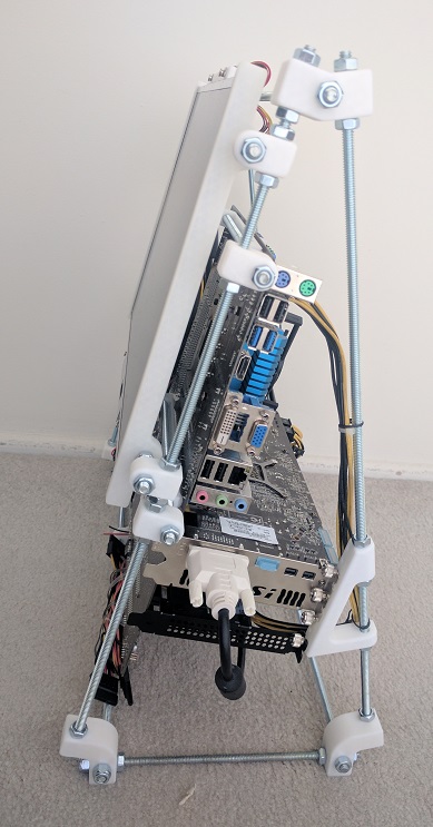
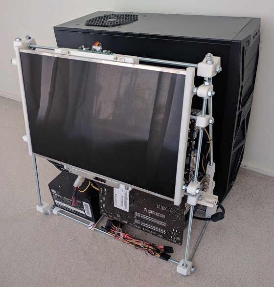
The easiest solution to that problem is to rotate the whole works 90 degrees. I tried it for a while and the upright screen sitting at table height level was ergonomically poor.

Laptops also have their screens at table height (one of my peeves against laptops) but at least their screens can tilt. I wanted to do even better than merely tilting: I aim for the OSHA ergonomic recommendation raising the top of the screen to eye height.

spaceThe wasted volume between the screen and the motherboard was another problem exposed by this prototype. The space looked small in CAD because the CAD model blocked out all the volume allocated by ATX spec. Since the actual motherboard consumed only a fraction of the allocated volume, the real world example had far more wasted space.

screenwingsI had the idea to solve both issues by raising the screen high to eye level, oriented horizontally, and tilt it into the empty volume. I never got as far as building it. Looking at the CAD layout, it is quite clear that the horizontally-oriented screen sticks out on either side of the case. This makes for a shape awkward to transport and also leaves the screen extremely vulnerable to damage. The screen height was good, but everything else was bad.

Plus, there was one more problem not addressed by any of these ideas: The screen glass surface is exposed while in transit. Laptops fold closed to protect the glass while travelling, but all these designs leave the glass exposed.

It became clear that no single static arrangement will have all of the desired qualities. Similar to a laptop, we will need some kind of mechanism to switch between two states.

  • Closed: A compact configuration for easy transport while protecting the screen from damage.
  • Open: An ergonomically desirable screen position.

Next post: The mechanism to address these challenges.

Luggable PC Motherboard Layout

The previous post described how I decided to position the PSU (Power Supply Unit). Once the position was decided, the next task is to determine the motherboard position.

The first challenge is my desire to accept a full-sized ATX motherboard. Full-sized boards are the easiest to work on and has the best feature set. They also have highest sales volume, which usually mean less expensive. I knew my project would be easier with a smaller microATX or Mini-ITX motherboard, but I wanted to accept full-size.

However, accepting the full size board doesn’t necessarily mean I intend to use all the expansion slots. In fact, I am happy to block the majority of them, leaving just the primary PCI-Express slot available to the GPU.

selectcards
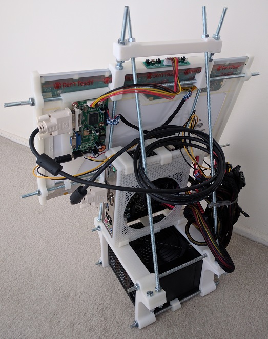
The GPU itself is the next challenge. The primary slot is close to the CPU, which means it is going to stick up in the middle of the board, making the whole assembly awkward to fit. Again, I have an escape if I want it: there are PCIe extension ribbons available for purchase that allows more positioning flexibility for the GPU. They range from $89 well-regarded units from Digi-Key to $7 roll-of-the-dice units via mystery retailers on Amazon (*). I want to make this idea work without use of an extension, and avoid the variable that introduces to the system.

While researching the layout, I learned the primary slot is not in the same position across all motherboards, adding to the challenge. While most boards position them in the slot closest to the CPU (all of the Mini-ITX boards have to by necessity) some of the boards place it in the second position. And since high-powered GPUs are two slots wide, that means I need to allow for three expansion slots worth of space.

selectcomponentsThe GPU in the middle of the board leaves two rectangular volumes on either side: Both volume are candidates for use. One volume sits over the remaining expansion slots, and the other volume sits over the CPU.

The volume over the expansion slots are predictable. ATX spec restricts height of motherboard components in order to maintain clearance for expansion cards. If I’m OK with the absence of cards, that entire volume can be reclaimed.

In contrast, the volume over the CPU is less predictable. While the ATX spec allocated volume to CPU and accessories (most significantly, the CPU cooler) that volume is highly variable. Stock CPU coolers typically take much less volume than allocated, and many fancy CPU coolers exceed the volume.

Given those two choices, it was an easy choice to snug the PSU up against the motherboard in the volume allocated to expansion cards that won’t be there.

The last factor in positioning the motherboard is which direction I wanted the ports to be accessed. Pointing down is inconvenient to access. Pointing up makes ports vulnerable to damage from dropped items. So that leaves pointing left or right. Since the PSU power cable port is already on the right, I decided to face all the ports that way as well so everything the user needs to plug in is facing the same way.

All of the above considerations resulted in the PSU+motherboard layout I used.

Next post: Positioning the screen.


(*) Disclosure: As an Amazon Associate I earn from qualifying purchases.

Luggable PC PSU Layout

To help optimize arrangement of Luggable PC components, I sketched them out in Fusion 360 so I can experiment with layout in CAD space. I was able to find the specification for the ATX motherboard and power supply, which allowed me to use official dimensions. Unfortunately I wasn’t able to do the same for the PCI-Express cards, because I needed to be a member of the PCI SIG to access the official specs. So I measured and guessed dimensions from the specific implementation I have on hand.

Power Supply Unit (PSU)

As the heaviest single component, I wanted the PSU at the bottom so the overall system is not top-heavy. The question is then: which way to orient the PSU? There were two considerations:

  1. PSU cooling intake: The standard ATX case layout places the PSU at the top of the case, drawing air from beneath. I can’t do that with the PSU at the bottom since a downward-facing intake would be blocked by the table surface. I tried the upward-facing intake once, in the Mini-ITX “Easel Frame 2.0” design. That turned out to be a bad idea because every time I dropped something (usually a screw) it would fall inside the PSU and I have to retrieve it to avoid short-circuiting the internals.
  2. PSU wiring: One side of the PSU takes the standard IEC AC cable. The opposite side is where all the DC wires go to the rest of the components. The decision is then whether to point them front-back or left-right. I didn’t want either of them to point towards the user, so I went with a left-right orientation for the wiring.

Taking care of those two considerations leave two good orientation for the PSU. One with the cooling intake facing front towards the user, or facing away from the user. In the current design, facing backwards allows an unobstructed air path so that’s the preferred position today.

Next post: Positioning the motherboard.

back


Luggable PC Gets Fancy Screen

closelidThe latest iteration of the home built luggable computer gets a fancy rotating screen to protect the screen while in transit and hold the screen up while in use.

The time pressure of making it ready for show-and-tell at the February Hackaday LA meet meant I hadn’t been documenting my lessons learned here.

Which is a shame, because there were quite a few 3D printing lessons learned while building this thing. I briefly mentioned a few of them on the project log update up on Hackaday.io but I intend to find the time to expand on those ideas as future posts on this blog. I just hope I can get them all written down before I forget.

Sheet Metal as Sign of Competition

onshape-sheetmetal-image02
Onshape sheet metal visualization

I’m personally comparing use of Onshape vs. Autodesk Fusion 360, seeing which one I prefer to use for my own projects. As I wrote earlier, each of them offer something I would miss if I started using the other exclusively.

In a close competition, everybody would learn from everybody else and the most important user features will propagate through all the offerings in the market. I wasn’t sure if the people behind Onshape and Autodesk Fusion 360 saw each other as competitors, but now I’m fairly confident that they do and are keeping an eye on each other.

The proof: Sheet metal.

a360-sheetmetal-shiftec
Autodesk Fusion 360 sheet metal preview

Onshape just unfolded their sheet metal feature. (“unfolded” their joke, not mine…) Autodesk said theirs is in a closed invite-only technology preview coming soon to all users. Such a similar feature introduced within a few weeks of each other might merely be a coincidence, but I doubt it. It certainly looks and sounds like they’re working to reach parity with each other’s features.

Additional proof: Constraints

Last time I wrote about the fact Onshape does a great job with constraints, letting the user know exactly where they stand in a way that Fusion 360 does not. At the time I didn’t know Fusion 360 has constraint visualization available as a “preview feature” that is turned off by default.

It is a good step forward for Fusion 360. As of the current preview, Onshape still holds a significant advantage in user friendliness, but the mere presence of the preview assured me that it’s on Autodesk radar and they’ll keep working away at it.

I like the progress I see so far. Competition making everybody better, and consumers win.

Fusion 360 vs. Onshape, Round 1

fusion-360-logo31Since completing the Udemy overview of Autodesk Fusion 360 a few days ago, I’ve started working on a project to get hands-on experience. Here are the items which made the strongest impressions after my first few days:

Advantage: Autodesk Fusion 360

UI Responsiveness: As an application executing locally, it is vastly more responsive to my actions than Onshape executing across the internet.

Integrated Assembly: In Onshape, parts are created in Parts Studios tabs and put together in a separate Assembly tabs. Parts need to have designated “mate connector” added to their designs before the assembly can occur. I never got the hang of this system. In contrast, every Design window in Fusion 360 can import parts from other designs without special entities like mate connectors.

Advantage: Onshape

Constraints: Onshape is really good about informing the user of constraints. Sketch entities are blue when they are under-constrained. When they are properly constrained, they turn black. When they are over-constrained, the conflicting constraints are all highlighted in red.

In contrast, Fusion 360 makes no distinction between under and properly constrained. My only indication an entity was under-constrained is long after the fact, when it would move unexpectedly in response to a change elsewhere. When over-constrained, a dialog box tells you the latest action causes over-constraining, but it doesn’t show you the conflicts so you’d have to go hunting for conflicting constraints yourself. This is a lot of lost time and a huge drain on productivity.

After a week of Fusion 360, this is the Onshape feature I miss the most.

UI scaling: Browser makers have lots of practice dealing with variable sized content on variable sized screens. Running Onshape in a browser window at 4K resolution was painless. In contrast, Fusion 360 scales poorly on a 4K screen, leaving many UI elements tiny and difficult to use.

Other Notes:

Sharing: Onshape free tier users are not allowed private documents, so every file is automatically shared with the world. Fusion 360 was designed for a world with designers and customers and clients, so it has a bunch of tools to manage access and permissions. In all that complication, they seemed to have forgotten to include a simple “share with the whole world” option.

Updates: Both of them update frequently. While it is easier to pick up an update in Onshape (refresh the browser) the Fusion 360 auto-update has been fairly seamless so far.

Udemy: Product Design in Autodesk Fusion 360

udemylogoTalking with some people at the Hackaday meet taught me that there are some real fans of Autodesk Fusion 360. It was already on my to-do list to evaluate the software, but the enthusiasm pushed it to the foreground.

The first frustration is learning the software. All the resources I found are in the form of tutorial videos. I personally prefer information in written text format, but I’ll watch the videos if I have no alternatives. The videos on Autodesk’s own site is built using a Flash-based video system. I avoid Flash when I can, so as an alternative I chose the udemy.com course titled Product Design in Autodesk Fusion 360 from idea to prototype.

The quality of the course was uneven: different sections in the course were recorded by different instructors each with their own style. Fortunately, the introductory and starting sections about content creation were pretty good, teaching me Fusion 360 basics and then how to create a design. (Sections 1 through 3)

Where these sections fell short was teaching me how to fix problems. That is, beyond hitting Control+Z immediately after a mistake. I know I’ll change my mind on certain design decisions and need to adjust the file later. The class didn’t spend much time over the editing tools and I felt this gap would prove to be a hindrance to my productivity.

Section 4: Rendering, animation, and drawings were very perfunctory and barely enough to get me started. If I actually want to make use of these features, I’ll need to find additional education before I can be proficient.

Section 5: Computer Aided manufacturing(CAM) assumed the student is already familiar with machining and wanted an overview on how to use their existing knowledge inside the Fusion 360 UI. If the student didn’t already know CAM, the section would make no sense.

I think I picked up enough basics for me to start poking around on my own to fill in gaps in my knowledge, so it worked well enough as a brief overview. I’m just a bit disappointed because my expectations were higher.

Homebuilt Computer now “Luggable PC” on Hackaday.io

hackadayioprojectI’ve known about Hackaday for a while, both the professionally curated site hackaday.com and the public participation site hackaday.io. Some of the people behind the site are nearby which allowed me to easily attend some of their local events.

Most of the project pages I browsed through dealt with Arduino boards, Raspberry Pi boards, or even lower-level hardware. I wasn’t sure if a home built PC is the right kind of topic for the site until I brought my current prototype to one of these local meets. The staffers present assured me that it’d be a great project to document on hackaday.io.

All right then! I’ve created a project page to document my work so far, and I’ll continue documenting future iterations over there instead of here.

One of the Hackaday staffers took an interest in the project, wrote up a short blurb and posted it on the curated hackaday.com. I am very flattered by the attention and it was a great opportunity to see how other Hackaday users viewed the project.

The best comments are from people who appreciate the project and had constructive ideas and suggestions – this is what the site promised for project builders and I’m happy to see it working as intended.

There were a few variants of “This isn’t what I want. I want to see…” and while they are good project ideas, they’re not what I’m trying to accomplish here. Maybe they’ll feel inspired by my project to bring their own ideas to life!

And finally, the comments that dismissed the project. Pointing out shortcomings (some fair, some not) as criticisms without offering anything constructive to address the alleged issues. I just shrug off such criticism and focus on my work.

Positive or negative, the overall quality of the comments are far more articulate and intelligent than your average comment on YouTube.

I call that a win for Hackaday.

Homebuilt ATX All-In-One Computer

Scaling upwards from the previous project, I’m moved up from the Mini-ITX board to a (nearly) full sized ATX motherboard. The larger motherboard required a few more fastener locations but was not a significant challenge. The new challenge in this version was the addition of the GPU and properly securing it to the case.

back

Given the triangular profile of the frame, it took a little effort to design the triangular frame to fasten the GPU metal bracket against. At least, as compared to the normal rectangular computer cases. Thankfully CAD software like Onshape have no fear of trigonometry calculations.

side

It all works together but I’ve lost most of the size advantage over the standard mid-tower case. Here it is standing in front of the case that used to contain these components.

sizecompare

While the overall volume is still smaller than the generic PC case, it isn’t smaller by a whole lot. Yes, I do incorporate a screen while the standard case does not, but like the standard case I have a lot of unused empty space in my volume. Even though this made cable management easier and neater, a lot of waste is left over.

I decided the previous Mini-ITX version was on the “too small” side, and we’ve overshot into “too large”. The next iteration of this experiment will try to shrink the design and work towards “just right”


The small 3D printed brackets seen on this page were designed in the OnShape project “Easel PC“, which is available as an OnShape Public Document.

Homebuilt All-In-One Mini-ITX Computer

The previous experiment 3D printed just an enclosure for the Mini-ITX motherboard itself, it didn’t have much of a computer around. This project expands on the idea by building something to hold the rest of the computer components.

The physical size is larger than the build volume of the 3D printer so additional hardware were brought into the equation. Emulating the design for some early RepRap 3D printers, I started using commodity hardware store threaded rods as building structure.

The power supply unit is the heaviest single element and employed to provide the stable base. The new addition to the project is the screen built out of the LCD panel salvaged from an old broken laptop. I used a controller board that translated standard VGA/DVI signal to the panel’s proprietary signal to connect the panel to the rest of this system. Such controller boards can be purchased from one of several vendors on eBay.

The cable management is better than the previous effort, which admittedly set a low bar. The PSU is nice and heavy providing a stable base. Compared to the commodity Mini-ITX case: the overall package takes less desktop space (especially considering the screen) and overall roughly the same volume of space.

easel-back
A better-managed but still a tangle mass of cables.
easel-front
3D printed all-in-one “Easel PC” with a commodity Mini-ITX case.

This is a perfectly usable (if not very neat or pretty) PC. If this were the final goal, I would take a Dremel cutting wheel to cut off the extraneous ends on the threaded rods. Since I have no real need for a Mini-ITX AIO PC at the moment, though, I’m taking the lessons learned and recycling the metal bits for the next project.

Enclosure for Mini-ITX board

Customized computer cases are an interesting area to explore for 3D printing. The home-built desktop PC market is blessed with the luxury of choice, with a wide selection of components a builder can choose from. As a result of this, most desktop PC cases are wide-open designs capable of taking most combinations of components. This directly proves the old adage: “Jack of all trades, master of none.” In contrast, someone with a home 3D printer can custom design for a specific need built around specific components on hand. The result would be a master of one.

Before I can embark on some grandiose vision, I started with a small project built around the MSI AM1I motherboard. It is an inexpensive and highly integrated PC motherboard on the Mini-ITX standard. It had been installed in a Mini-ITX case that, though smaller than most desktop PC cases, still had a lot of wasted volume present to accommodate for components that I never installed.

fullcase
Mini-ITX computer with a great deal of wasted volume.

The Mini-ITX standard restricted the motherboard size to 17cm squared, which is convenient because my 3D printer can print up to 20cm squared. This meant I could print something encompassing the ITX dimension in one piece. I pushed for full minimalism resulting in this design available as OnShape public document “Mini-ITX enclosure“.

emptycase
3D printed Mini-ITX enclosure.

It has screw holes for only the mainboard and the power supply. The large hole on top is tailored for the specific power supply I had on hand, positioning its fan immediately above the motherboard. This allowed removal of the noisy CPU fan as the large power supply fan can pull double duty cooling the whole works resulting in a small neat compact setup.

When I assembled the parts, though, things didn’t look as neat as I imagined:

minimalist
My, what a tangled nest you have.

I had underestimated the chaotic bundle of wires coming out of the power supply. Most of the wires were completely unnecessary and could be cut if this were the final product, but I didn’t want to do that just for an experiment. The remaining wires could be shortened for such a compact layout, but again I didn’t want to break out the wire clipper and soldering iron for sake of the experiment.

The other item I didn’t account for was the storage device, in this case an old SSD in 2.5″ form factor, awkwardly wedged into a slot. (See the red SATA cable in the picture.) I justified this oversight by the fact that most modern ITX boards have on-board M.2 SSD slots, making a separate mounting bracket unnecessary. Truthfully, though, I forgot.

I had fun building this proof-of-concept with old expendable components in case something went wrong. Next custom PC project will be bigger, with more powerful components, and hopefully the wires will be better managed as well!

Let the App… Materialize!

materializecsslogo
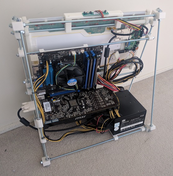
After I got the Google sign-in working well enough for my Rails practice web app, the first order of business was to build the basic skeleton. This was a great practice exercise to take the pieces I learned in the Ruby on Rails Tutorial sample app and build something of my own design.

The initial pass implemented basic functionality but it didn’t look very appealing. I had focused on the Rails server-side code and left the client-side code simple plain HTML that would have been state-of-the-art in… maybe 1992?

Let’s make it look like something that belongs in 2017.

The Rails tutorial sample app used Bootstrap to improve the appearance and functionality of the client-side interface. I decided to take this opportunity to learn something new instead of doing the same thing. Since I’m using Google Sign-In in this app, I decided to adopt Google’s design concepts to my client-side appearance as well.

Web being the web, I knew I wouldn’t have to start from scratch. I knew about Google’s own Material Lite and thought that would be a good candidate before I learned it had been retired in favor of its successor, Material Components for the web. One of the touted advantages was improved integration with different web platforms. Sadly Rails was not among the platforms with examples ready-to-go.

I looked around for an existing project to help Rails projects adapt Google’s design language, and that’s when I found Materialize: A library that shares many usage patterns with Bootstrap. The style sheets are even written using SASS, native to default Rails apps, making for easy integration. Somebody has done that work and published it as Ruby gem materialize-sass, so all I had to do was add a single line to use Materialize in my app.

Of course I still had to put in the effort to revise all the view files in my web app to pick up Materialize styling and features. That took a few days, and the reward for this effort is a practice web app which no longer look so amateurish.